PINK

September – December 2023

R.C. Baker
Eric Brown
Deborah Buck
Bell and Ganassi
Mr.
Jaye Moon
David Salle

The color pink was used by ancient Egyptians, Greeks, and Romans, and gained prominence as a distinctive hue during the Rococo era in the 18th century. The 20th century marked a shift in its significance, as pink came to be a subject, to convey light, emotion, and a sense of fleeting moments.  The exhibition PINK deconstructs the themes of identity and sexuality, dismantling gender binaries while confronting vulnerability and intimacy.  The artists who harness the power of pink in the featured works wield enormous influence in evoking emotions, questioning norms, and shaping narratives using the multiplicity of interpretation.  PINK is a pursuit of breaking stereotypes, signaling emotional abundance with great vigor. 
R.C. Baker Holy of Holies, 2018 Lava lamp, vintage album and jacket, wood, paint  25 x 17.5 x 8 in.

Holy of Holies exists at the intersection of two legends: Lou Reed and Andy Warhol. Lou claimed that the Velvet Underground’s first album sold only 30,000 copies, yet it became one of the most influential rock records of all time. Andy, the band’s manager, created the banana-peel cover, a sendup of the macho ethos of rock ’n’ roll that neither the gay, devoutly Catholic artist nor the group shared. Holy of Holies is a shrine to a Downtown scene that reveled in camp but suffered no fools. 

R.C. Baker
Holy of Holies, 2018
Lava lamp, vintage album and jacket, wood, paint 
25 x 17.5 x 8 in.
Deborah Buck The Swan, 2023 23 X 19 in. Acrylic and sumi ink on board with vintage ebonite and silver gilt frame

Truman Capote turned women into his swans elevating them to an elegant closed club and the fairy tale The Ugly Duckling.

Deborah Buck

The Swan, 2023

Acrylic and sumi ink on board with vintage ebonite and silver gilt frame

23 X 19 in.

MR. Untitled, 2012 Acrylic painting on the found snowboard 13 x 61 in

Mr.’s work aspires to blur the distinction between the interior and exterior inhabited by familiar objects that are conversely used to communicate the unfamiliar.  Mr.’s ongoing exploration of otaku, the Japanese “cute” subculture marked by an obsession with technology, sci-fi literature, anime, and video games, is characterized by bright colors and uplifting imagery. Like Superflat artists, Mr. approaches the visual language of manga.

MR.

Untitled, 2012

Acrylic painting on the found snowboard

13 x 61 in

Laura Bell and Ian Ganassi The Corpses: Party Like Barbie, 2023 Mixed media on cardboard 14 x 9.5 in.
A Barbie lunchbox keychain from way back when, found in the midst of Barbiemania in a collage bin, and a leftover gadget for filling water balloons with a garden hose, found their way onto a collage of cut-up birthday cards and packaging materials. The resulting explosion pulled in stars and a couple of other miniature accessories, and, of course, lots of pink.
 

Bell and Ganassi

The Corpses: Party Like Barbie, 2023

Mixed media on cardboard

14 x 9.5 in.

Jaye Moon People Like You Need To Fuck People Like Me, 2012 Neon, transformer 2 6 x 35.4 x 2.6 in Edition of 5

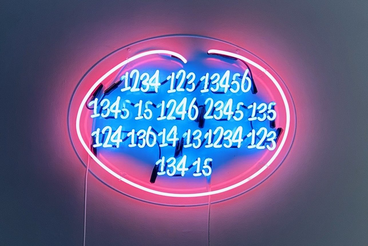
The visually striking Neon work, People Like You Need To Fuck People Like Me (2012), is Moon’s rework of Tracey Emin’s iconic People Like You Need To Fuck People Like Me, 2007. Moon transcribed Emin’s tantalizing, confessional message into Braille, and this Braille is converted into numbers. Moon uses this mode of language for the unseen, for its visual and universal utility, to shatter the ice in the silenced discussion of female sexuality.  Emin’s feminist message is widely received in the West, yet in many Asian cultures, expressing sexuality, especially female sexuality, is discouraged.  By translating Emin’s raw message into numerical code, a form of Braille, Moon opens up the possibility to hail the same message without fear of ostracism or penalty.

Jaye Moon

People Like You Need To Fuck People Like Me, 2012

Neon, transformer

2 6 x 35.4 x 2.6 in

Edition of 5

Eric Brown Untitled (4-17), 2020 Color pencil and graphite on paper 14 × 11 in.

Central to Eric Brown’s works on paper is process. The artist is pursuing a new abstract vocabulary through the repetition of mark-making.  In the process, a painterly minimalism emerges that is direct, unadorned, meditative, and intimate. They lend themselves to metaphors of strength and vulnerability, mending, imperfection, and domesticity.

Eric Brown

Untitled (4-17), 2020

Color pencil and graphite on paper

14 × 11 in.

David Salle Overunder (red, blue, white, pink, yellow), 2021 Archival pigment ink print, hand varnished on Innova Etching Cotton Rag 315 gsm 42 x 42 inches, each Edition of 20

David Salle invokes 19th-century images, 1950s advertisements, graffiti, cartoons, and photographs. He embraces different moods, styles, and sources, and his compositions alternately invite and reject psychological, associative interpretations that offer commentaries on contemporary life.

David Salle

Overunder (red, blue, white, pink, yellow), 2021

Archival pigment ink print, hand varnished on Innova Etching Cotton Rag 315 gsm

42 x 42 in. , each

Edition of 20

Current

PRIDE AND INSOUCIANCE

February – April 2024

Categories: online-exhibitions