Silvana Agostoni
Artist Statement
I have always felt the need to directly engage with the body.
To enthrone, enshroud or reveal it.
To address it’s scale, it’s sexuality, and it’s frailty.
I believe that of all the objects of perception, the human body is the one that has more effect on our sensibility, because it is ours, because it contains us.
The central idea of my work is the attraction and repulsion that is evoked by the human body.
By dissecting, magnifying and dislocating the body, I render it anonymous, strange and explore the issue of identification of the body with the self. My intention is to create an uncanny bodily universe that draws in the viewer, and use the body as a bridge between the images and the spectator. I seek to elicit a reaction from the spectator based on physical recognition.
The “mirror stage” according to the French psychoanalyst Jaques Lacan is the first stage in the formation of identity. Between the age of six and eighteen months the infant experiences his body as fragmented and dispersed. When the child recognizes himself in the mirror, he creates an ideal self-image and creates an imaginary physical control, which he has yet to attain.
The body is marked out as a unified totality, complete and whole.
In contrast to this conception, my work represents the body as a vital chaotic force that is excluded from the false control, unity, identity and perfection of the ‘mirror stage’.
I want to introduce strangeness and unfamiliarity where a mirror image is expected, in order to obscure an anticipated pleasure of ideal reflection.
I seek to reveal both the violence of vision by photographing body parts with a clinical eye and the beauty of the body under a microscopic vision.
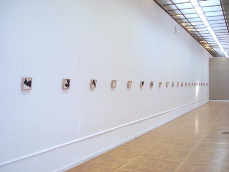
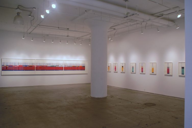
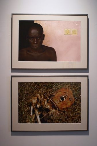
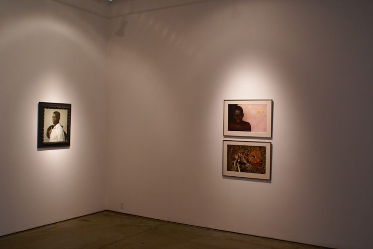
The work I am presenting is from two series. One is called Fisonomía: 16 C-prints
all 50 x 50 cm and Topografías: 10 C-Prints 50 x 50 cm and 10 C-prints
120 x 120 cm.
In both bodies of work, the body can be seen as a terrain in which I suggest the simultaneous existence of binary oppositions such as inside/outside, masculine/feminine, I/ otherness.
Silvana Agostoni
Education
1994-1997: Master of Fine Arts in Photography. School of Visual Arts, New York, NY, USA.
1990-1994: BFA in Graphic Design. Universidad Autónoma Metropolitana, Mexico City.
Solo exhibitions
- Esfera, Observatorio XP. Morelia, Michoacán, Mexico.
- Silvana Agostoni, Topografías.Centro de la Imagen, Mexico City.
- Fisonomía. Instituto Michoacano de Cultura, Morelia, Michoacán, Mexico.
- Silvana Agostoni, Physiognomy.White Columns, New York, NY. USA
- Construcciones Corporales. Art Deposit, Mexico City.
- Imágenes Etéreas. Galería de la Imagen. Universidad Autónoma del Estado de Querétaro. Mexico
Group exhibitions
2006
Zonema. Zone-Chelsea Center for the Arts. Nueva York, NY, EUA.
Hit the showers. Other Gallery. Banff Centre for the Arts. Canada
Fesitval Internacional de videoarte e Valencia. Valencia España
2005
The image outside of time. Antimatter Underground Film Festival. Victoria, Canada.
2004
2ª Bienal Nacional de Yucatán. Mérida, Mexico.
La Imagen que extraña al tiempo. Chroma video festival, Guadalajara, México.
Piel de Pieles, Barcelona Arte Contemporáneo, La Santa, Barcelona, Spain.
Creación en Movimiento, Galería Central, Centro Nacional de las Artes, México City.
2003
Creación en Movimiento. Galería Kunsthaus Santa Fe, San Miguel de Allende, Mexico.
El Sentido y los Sentidos, Espacio Cultural, Universidad Iberoamericana, México City.
2002
There is no translation. Prinzz Gallery, Kyoto, Japan.
ARCO 2002. Galería Enrique Guerrero, Madrid, Spain.
Salón Internacional de Arte Digital, Casa de América, Havana, Cuba.
ABC DF Palabras de Ciudad. Museo del Palacio de Bellas Artes. Mexico City.
Muestra 001. Contemporary Art Fair, Galería Enrique Guerrero, Monterrey, Mexico.
Fast Fwd. Galería Enrique Guerrero, Miami, Florida, USA.
2001
Intro. Museo Dell´ Arredo Contemporáneo, Ravenna, Italy.
Arco 2001. Galería Enrique Guerrero, Madrid, Spain.
Momenta, Arte Electrónico, Centro Nacional de las Artes, Mexico City.
Latin American Artist-Photographers from the LUAG Collection, El Museo de Historia, Antropología y Arte,
San Juan, Puerto Rico.
2000
Latin American Artist-Photographers from the LUAG Collection, Museo del Barrio, New York, NY, USA.
VI Salón Bancomer-BVA, Fundación Cultural Bancomer, Mexico City.
Salón CANT V, Jóvenes con FIA, Galería Ateneo, Caracas, Venezuela.
Galería Enrique Guerrero, Feria Internacional de Arte, Caracas, Venezuela
1999
Herejías. Peep Show, Galería del Centro Multimedia, CNA. Mexico City.
10 Mexican Photographers: A select end of the century generation. Dubois Gallery. Pennsylvania, USA.
XVIII Encuentro Nacional de Arte Joven. MUCA, Mexico City.
1998
New Visions: Five Contemporary Mexican Photographers. Houston Center for Photography. Houston, USA.
Foto construcciones, Museo de Arte Contemporáneo Alfredo Zalce, Morelia, Michoacán, Mexico.
New York Digital Salon, Visual Arts Museum, New York, NY, USA.
1997
Salón Digital, Círculo de Bellas Artes. Madrid, Spain.
XVII Encuentro Nacional de Arte Joven, Museo Carrillo Gil. Mexico City.
8a Bienal de Fotografía, Centro de la Imagen, Mexico City..
Grants
2006: Residencia artística (Fotografía) Banff Centre for the Arts y FONCA.
2002-03Young Artist production award (Jóvenes Creadores). FONCA. Mexico.
2000 Cultural project award (Coinversión y Fomento a Proyectos Culturales.) FONCA. Mexico.
1999 Digital imaging residency. Centro Multimedia, CNA. Mexico.
1998 Young Artist production award (Jóvenes Creadores). FONCA. Mexico
1995-97 IPS grant, American Association of University Women, New York, NY, USA.
1995-97 Study abroad grant. FONCA. Mexico
Distinctions
Selected at the 2ª Bienal Nacional de Yucatán. 2004
Selected at the Salón Bancomer, 2000
Selected at the Octava Bienal de fotografía. 1998
Selected at the Encuentro Nacional de Arte Joven 1998
Selected at the Encuentro Nacional de Arte Joven 1997
Teaching experience
2005: Personal vision: Centro de la Imagen, Mexico City.
Conceptual photography. Centro de Las Artes, Monterrey NL., Mexico.
2002: Photography after photography. Centro Multimedia, CNA, Mexico City.
2001: Profesor of photography, seminar. BFA in Visual Arts, UAEM, Mexico.
1999: The digital image . Centro de la Imagen. Mexico City.
1998: Photography in the age of digital reproduction. Centro de la Imagen. Mexico City.
Lectures
2003: Primer Coloquio de Fotografía UAM-X: The photographic image as text.
Universidad Autónoma Metropolitana, Mexico City.
2002: Art and Photography at the Centro de la imagen: Lecture on personal work.
Selected Bibliography
- 52 Mujeres en el Arte Mexicano. Catálogo publicado por SEDESOL y CONACULTA, Mexico, 2005.
- El Arte en México. Catalog published by Financiarte. Mexico. 2004.
- Creación en Movimiento, Jóvenes Creadores. Catalog, CONACULTA-FONCA, Mexico. 2003.
- Segre Erica, The Poetics of Skin. Surface and Inscription in Contemporary Mexican Photography.
Bulletin of Hispanic Studies, Vol 79, no.3. Liverpool University Press. July, 2002.
- ABC DF, Diccionario Gráfico de la Ciudad de México. Diamantina. 2001.
- Luna Córnea, 21/22. Centro de la Imagen-CONACULTA. 2001.
- Silvana Agostoni, catalog published by Galería Enrique Guerrero, Mexico 2000.
- VI Salón de Arte Bancomer. Catalog. Fundación Cultural Bancomer. Mexico, 2000.
- Medina Cuauhtemoc, Ejercicios del no-lugar. Article published in journal Reforma, may 31, 2000.
- Castellanos Alejandro, Al filo del siglo. Panoramas, february, 2001.
- Sepúlveda Luz Maria, El Cuerpo Humano en la Fotografía Actual. Tierra Adentro #105. CONACULTA. Mexico,
- 10 Mexican Photographers. A select end of the century generation. Catalog. Dubois Gallery, PA, USA. 1999
- Rodríguez José Antonio, Por ver no se paga: imágenes olvidadas. El Financiero, Mexico, August 26, 1999.
- Rodríguez José Antonio, Foto Mexicana de entre siglos. Tierra Adentro #100. CONACULTA. Mexico, 1999.
- Rodríguez José Antonio, Octava Bienal: una renovación. El Financiero. México, October 23, 1997.
- Arreola Magalí,Revigorizar la fotografía mexicana. Reforma. Mexico, September 24, 1997
- New York Digital Salon. Catalog. Leonardo: Journal for Art and Sciences. Vol. 30 No. 5. MIT Press. 1997
Steven Assael
Steven Assaelwas born in New York, New York in 1957. He attended Pratt Institute and presently teaches at The School of Visual Arts in New York. Mr. Assael balances naturalism with a romanticism that permeates the figures and surroundings of his paintings and drawings. The focus of his work is the human figure, either individually or in a group, rendered in glowing relief by gentle beams of warm and cool light. Steven Assael’s classical talents are as rare as they are essential to the diverse art world of the late Twentieth Century.
Assael has had several solo shows nationally in recent months, including the Columbus Museum of Art, Cress Gallery of Art at the University of Tennessee, Lowe Gallery in Atlanta, and Forum Gallery in Los Angeles. In 1999, a retrospective one-person exhibition was held at the Frye Art Museum in Seattle, Washington. Steven Assael’s work has also been exhibited at The Arkansas Arts Center, (AR), The New York Academy of Art, (NY), The Arnot Art Museum in (NY) and is represented in the public collections of The Hunter Museum of Art in Chattanooga, (TN), The Kemper Museum of Contemporary Art & Design (MO), The Columbus Museum of Art (Columbus, OH) and the Metropolitan Museum of Art (NY).
http://www.forumgallery.com/adetail.php?id=207
Monique Baumann
Monique Baumann was born in 1959 in Zofingen. After completing foundation courses at art schools in London and Zurich, she studied graphic design at the Lucerne School of Art and Design. Since 1990, she has worked as an independent artist and illustrator. Her work has been published in various international magazines and books and has received numerous awards. In recent years, she has participated in group shows at Palais Lichtenstein, Feldkirch, Austria (2004); Galerie Gruner + Jahr, Hamburg, Germany (2005); and at Palais de Tokyo Hypegallery, Paris, France (2005). Monique Baumann has been living and working in Zurich and Paris since 1995.
Artist Statement
I often use found materials as a starting point for my work. I like to transform something that is already there into something new, engaging in a dialogue with the material and thus creating a new story. This process is a way of engaging with my urban environment and with contemporary reality, an immediate, sensual commentary and reflection on the world around me.
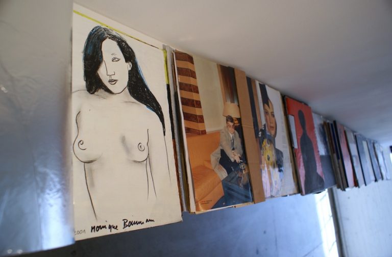
Painted Magazines
For a year I was commissioned to illustrate a column for the weekend supplement of the German newspaper “Sueddeutsche”. Instead of just archiving my specimen copies, I decided to rework each copy into a kind of artist’s book. Each focuses on a theme –a story, a topic that preoccupied me at the time, or a formal experiment. I used and combined a variety of techniques: I was painting and drawing in oil, acrylic, and ink, or I created collages with tape, postcards, photos and so forth. Sometimes I would integrate part of the contents of the magazine, sometimes I covered them entirely with my own work. Whereas the original magazine’s pages are rather thin and fragile, the reworked magazines have entirely different material quality. They are tangible objects, almost a kind of sculpture. Although each issue is self-contained, their entirety constitutes a chronicle of year in my life, reflecting my personal, formal, and intellectual preoccupations.
Polaroid Miniatures
I often take photographs, whether it’s analogue, digital, or Polaroid photographs. I decided to use my discarded Polaroids as a material basis for miniature paintings. Their format was a challenge since it called for a maximum reduction and condensation. The Polaroid Miniatures are mostly portraits. Some are inspired by the photographic image underneath the painting that was both extinguished and transform by it. Others were inspired by my collection of magazine photographs and everyday photography that I reinterpret in my paintings. Once again, I used a variety of styles, adapting my manner of painting to the subject at hand.
Monique Baumann
Santiago Cal
Artist Statement
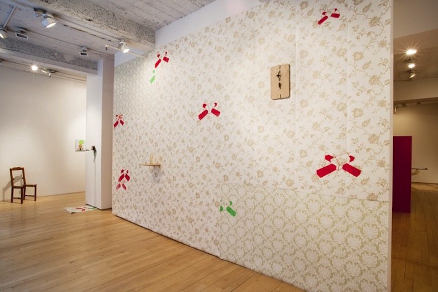
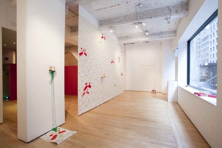
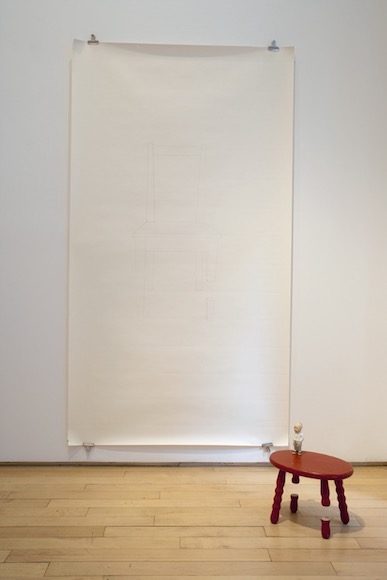
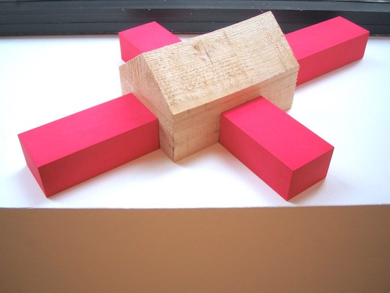
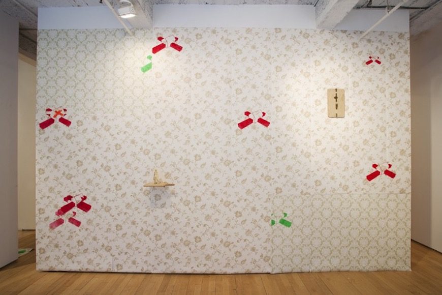
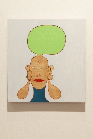
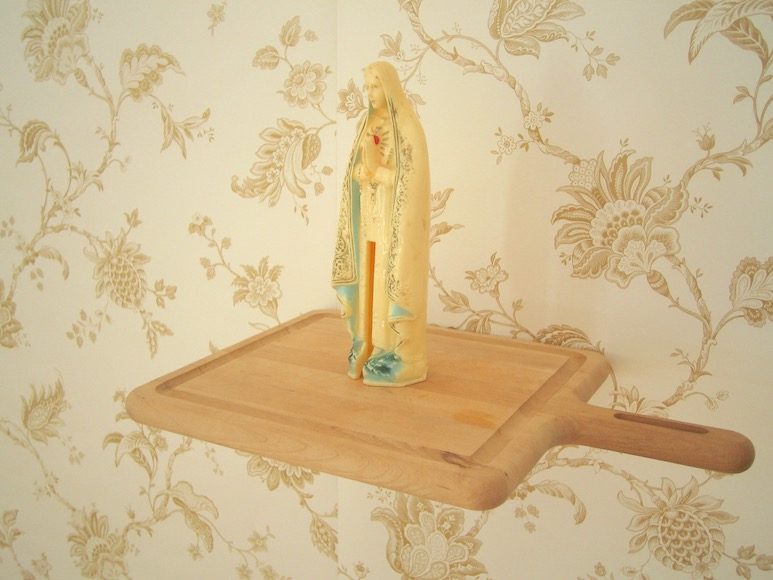
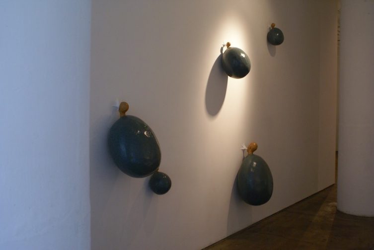
The human image and its contextual implications have been the primary focus of my sculpture. The threads that run through my works are based on observations from my travels as well as the vastness of children’s dreams. These two work hand in hand, since most of my observations are of children daydreaming, entertaining themselves with meager objects and the Don Quixotesque role-playing. My interest in these activities boils down to the ability of participating in two realities at once; our reality and their conjured reality. This activity may be only a few seconds or a few minutes but in their minds they have tapped into an epic moment, a different scale of time.
I am not interested in illustrating these moments but instead creating scenarios that allude to a narrative, which causes the viewer to create their own conclusions. The elements that act as catalysts for this to occur range from Rorschach like blots to mirrors which serve as invitations for the viewers to become integrated into the piece. In other works I manipulate an ordinary event by shifting the scale of the figures or creating a magical moment by stacking balls that seem to defy gravity. Although the pieces may seem as pleasantly wholesome they also contain elements of dark humor, melancholia and pointed social statements, all contributors to our inner dialogue and subconscious.
-Santiago Cal
Education
1998 M.F.A. – Virginia Commonwealth University. Richmond, VA
1995 B.F.A. – Kutztown University. Kutztown, PA
One Person Exhibitions
2007 just looking. Te Tuhi. Manukau City, New Zealand
2006 dory.Lied Gallery. Creighton University. Omaha, NE
2005 Tierra! Tierra! Sheldon Memorial Art Gallery. Lincoln, NE
2003 new dose. Casa de Las Americas. Havana, Cuba
encounters. Olimpo Centro Cultural. Merida, Mexico
dissemination.Marxhausen Gallery. Concordia University, Seward, NE
electric fences. Capella de Los Remedios. Santo Domingo, Dominican Republic
durable view. Image Factory Art Foundation. Belize City, Belize
2001 milk clouds. Image Factory Art Foundation. Belize City, Belize
Selected Group Exhibitions
2007 Landings6.Centro de Wilfredo Lam. Havana, Cuba
Landings5. Art Museum of the Americas. Washington, DC
Landings4.Museum of Contemporary Art and Design. San Jose, Costa Rica
Bemis at 25.Lied Gallery. Omaha, NE
2006 Landings2.Centro de Artes Visuales. Merida, Mexico
Landings3.Centro Cultural de Eduardo Leon Jimenes. Santiago de Los Caballeros,
Dominican Republic
9thHavana Biennial. Havana, Cuba
We are Belize – 25 Years of Independence 1981–2006. Kaohsiung Fine Art Museum.
Kaohsiung, Taiwan
La Escultura Contemporanea. Jan Weiner Gallery. Kansas City, MO
The Tugboat Show.Sheldon Memorial Art Gallery. Lincoln, NE
We are Belize. Image Factory Art Foundation. Belize City, Belize
5thAnnual All Sculpture Show.Jackson Artworks. Omaha, NE
Botanicals.Eisentrager-Howard Gallery. Lincoln, NE
1stACP Festival. Museo de Arte Moderno. Santo Domingo, Dominican Republic
Tugboat Presents.Elder Gallery. Lincoln, NE
2005 Small Wonders: a return to innocence. Home of Matthew. Lincoln, NE
Latta Pichaz.Image Factory Art Foundation. Belize City, Belize
@10.Image Factory Art Foundation. Belize City, Belize
2004 Nebraska Now.Bemis Center for Contemporary Art. Omaha, NE
Landings- Conkal Arte Conteporaneo. Conkal, Mexico
West by Southwest– Burris Art Gallery. NMHU. Las Vegas, NM
2003 UNL Studio Art Faculty Exhibition. Eisentrager-Howard Gallery. Lincoln, NE
Coleccion de la Fundacion GruberJez – Ex Convento de Conkal. Conkal, Mexico
2002 Zero- Ex Teresa Arte Actual. Mexico City, Mexico
Contemporary Art from Central America Isthmus – Taipei Fine Arts Museum.
Taipei, Taiwan
Zero- Museum of Modern Art. Santo Domingo, Dominican Republic
Zero- Galeria Sala Mendoza. Caracas, Venezuela
Zero- Galeria Sol del Rio. Guatemala City, Guatemala
Zero- Ex Convento de la Compania de Jesus. Antigua, Guatemala
artISMO- Museum of Contemporary Art and Design. San Jose, Costa Rica
ARCO– Galeria Sol del Rio. Madrid, Spain
Zero- Gallery Ze Dos Bois. Lisbon, Portugal
2001 Zero- La Capella. Barcelona, Spain
IV Caribbean Biennial- Museum of Modern Art. Santo Domingo, Dominican Republic
20/XX- Image Factory Art Foundation. Belize City, Belize
Zero- Casa de Las Americas. Havana, Cuba
UNL Studio Art Faculty Exhibition- University of Nebraska. Lincoln, NE
1998 Notorious, New Sculpture. Armory Gallery. Blacksburg, VA
searching for green. Thesis exhibition. Anderson Gallery. Richmond, VA
1997 The Movable Feast. 1708 Gallery. Richmond, VA
Dr. Louis Harris Awards Exhibition. MCV Hospital. Richmond, VA
New Works by New Artists. James Center. Richmond, VA
7thAnnual National Juried Show. Donald Kuspit – Juror. 1708 Gallery. Richmond, VA
Grants and Awards
2007 Nebraska Arts Council Individual Artist Fellowship
2006 Maude Hammond Fling Faculty Research Fellowship. University of Nebraska.
Lincoln, NE
2005 Artist in Residence- Bemis Center of Contemporary Art. Omaha, NE
Research Council Grant in Aid. University of Nebraska – Lincoln
2004 Nebraska Arts Council Individual Artist Fellowship
Hixson-Lied Faculty Research Grant. University of Nebraska- Lincoln
2003 Artist in Residence – Poustinia Land Art Park. Benque Viejo del Carmen, Belize
Hixson-Lied Faculty Seed Grant. University of Nebraska- Lincoln
2002 Artist in Residence – Gruber- Jez Foundation. Cholul, Mexico
Layman Research Grant. University of Nebraska- Lincoln
Research Council Grant. University of Nebraska- Lincoln
2001 Fine and Performing Arts, Dean’s Research Grant. University of Nebraska- Lincoln
Layman Research Grant. University of Nebraska- Lincoln
Humanities Center Summer Research Grant. University of Nebraska- Lincoln
Human Rights and Human Diversity Research Grant. University of Nebraska- Lincoln
Selected Press and Reviews
Umelec Spring 2007. Czech Republic
ArtNexus. No.63. Miami, FL. 2007
ArtWorld Digest. March 2006. Brooklyn, NY
Belize Times. 6//2006 Belize City, Belize
Art Papers. July/August 2005. Atlanta, GA
La Prensa Literaria.11/20.2004. Managua, Nicaragua
Artes Revista Especializada en Arte Caribeno. October/December 2003.
Santo Domingo, Dominican Republic
Gramma International Digital.4/23/2003. Havana, Cuba
Por Esto. 6/19/2003 Merida, Mexico
Art Nexus. No. 46 Miami, Florida
El Caribe. 10/30/02 Santo Domingo, Dominican Republic.
El Nacional. 6/15/02 Caracas, Venezuela
Prensa Libre. 4/8/02 Guatemala City, Guatemala
Atlantica Art Journal. 2/02 Madrid, Spain
ABC.2/18/02. Madrid, Spain
Time Out. 1/02 Barcelona, Spain
Casa de Las Americas Journal. 7/01 Havana, Cuba
El Pais. 12/01 Madrid, Spain
Rainer Judd
Rainer Judd’s photographs of natural landscapes are often perceived as painting until closer examination. As a filmmaker trained in the use of 16mm film her sense of the “grain” of a photo simulates a type of “chiaroscuro” within the image. Judd’s use of low tech equipment and techniques allows her to engage herself in the image capture. Every day places are transformed into abstract components of color and texture. The viewer is challenged to discover the image components while experiencing the visceral spaces and colors of the natural landscapes.
Judd’s watercolors of natural landscapes are made with small and specific brush strokes or “dots” used to define textures, subtle color shifts, numerous trees, grasses, and land; imagery such as an extremely leaning tree or the shadow of an animal gives an emotional quality to the landscape.
Her specific use of technique and imagery choice illuminates a reverence for a time and a place and references a narrative framework in both the imaginary world of her watercolors and the “real” places of her photography.
Filmography
writer and director
Remember Back, Remember When(2007) 9 min super16 director
Marfa Voices, a work in progress(2006) 42 min video co-director
Lost and Found(1992) music video 3 min16mm director
Plague Circuit (1991) 18 min 16mm director
Three Pieces of Real Texas Time(1990) 10 min video director
Waste Generation(1990) 6 min video director
Instant End(1989) 5 min 16mm director
Sprout (1989) 5 min 16mm director
Carmelita’s Reception House (1989) 17 min 16mm segment director
Pantera(1989) 3 min 16mm director
Untitled #1(1989) 3 min16mm director
producer
Marfa Voices, a work in progress(2006) 40 min video producer
Tales of Cerro Chino(1992) 60 min video producer
Foxtrot Romeo Film Festival, Marfa, Texas 1991-1993
actor
The Picture of Dorian Gray(2004)
The Pornographer, A Love Story(2004)
Wake(2003)
Town and Country(2001)
Reunion(2001)
Perfume(2001)
Head Games(2001)
Lost Souls(2000)
End of Days(1999)
The Hi-Line (1999)
Pure Killjoy(1998)
Long Time Since (1997)
Hugo Pool(1997)
Drowning in West(1996)
Jack (1996)
Toughguy(1995)
selected crew
Even Cowgirls get the Blues(1993) set costumer
Betty Carstairs Story(1991) videographer, The Wooster Group
The Fisher King(1991) wardrobe assistant
New York Stories(1989) production assistant, segment “Life Without Zoe”
Anna (1988) production and post assistant, Magnus Films
Lives and works in Hudson and New York City
B.A. film New York University, Tisch School of the Arts 1991
selected exhibitions
2007 CCCA Studio Tours Art in the Landscape, Columbia County, NY
2006 Manhattan TransferZone Chelsea NY, NY
ZC Collection Zone Chelsea NY, NY
2004 Manhattan Transfer Chatham, NY
Shout! Time and Space Limited, Hudson, NY
2003 101 Spring St.,Zing Magazine curated by Madeleine Hoffmann
2001 Silverlake Silverlining, Los Angeles, CA
Show, Pageant, Los Angeles, CA
awards
2007 Art Production Fund, Artists at Giverny Residency and Grant
1991 Texas Award at Dallas Video Festival for Plague Circuit (1991)
panels and discussions
2007 Judd Foundation: Oral History for Artist’s Legacies, a panel discussion.
2007 New York Foundation for the Arts: Artist’s Forum
2006 Zone Chelsea, John Weber’s Columbia County Artists discussion
press
Inside Out Hudson valley, January/February 2007
W Magazine, November 2006
Berkshire Living, February/March 2005
brilliant magazine, October 2004
Upstate House, October 2004
Interview Magazine, February 1992
selected collections
Arne Glimcher
Marc Glimcher
Jaime Frankfurt
John Howard
Jean Gabriel Mitterand
Carol Taylor
Kristen Justesen
Kirsten Justesen *1943. Lives and works in Copenhagen.
Educated at the Royal Academy of Fine Arts 1975. Cand.phil 1977.
A series of exhibitions, events, installations, performances and mural work in Denmark and the rest of world since the mid-60s.
Visiting professor and lecturer at art academies in Scandinavia, the USA and the Middle East.
Scenographic work at a number of Danish theatres since 1967; established the Scenography Department at the Danish National Theatre School in 1985-1990.
Important co-operations in the 90s include concept and set design for Randi Patterson Company.
Curated Body as Membrane together with VALIE EXPORT at Kunsthallen Brandts Klædefabrik 1995
Justesen has received a series of grants, including the Anne Marie Telmanyi Award 1991; The Eckersberg Medal 1996; Life grants from The Danish Art Foundation 1998; The Carl Nielsen & Anne Marie Carl-Nielsen Award 2000; The Anna Nordlander Award 2003;The Thorvalsen Medal 2005 and a ISCP residency, New York 2006.
Justesen has illustrated books, magazines, designed posters and a series of chasubles for Capernaum Church in Copenhagen.
KORS DRAG was published 1999 at Brøndum.
Represented in private and public collections, including Statens Museum for Kunst; The Dep. of Prints and Drawings; Museum of Modern and Contemporary Art, Aalborg; the New Carlsberg Foundation; Køge Art Museum of Sketches; Museum of International Ceramic Art of Denmark; The Art Museum Brundlund Castle; Museum Anna Nordlander, Sweden.
Member of the Artist Society and the Academy of Fine Arts.
Member of the board of The Odin Theatre, Holstebro and Kaleidoskop, Copenhagen.
Kirsten Justesen’s activities comprise a wide range of genres, from body art and performance art to sculptures and installation. Justesen was part of the avant-garde scene of the 1960s, where she became a pioneering figure within the three-dimensional modes of art that incorporate the artist’s own body as artistic material. These experiments led her in the direction of the so-called feminist art which challenged traditional value systems during the 1970s. Her later works constitute broader investigations of relationships between body, space, and language.
Reviews:
http://findarticles.com/p/articles/mi_m1248/is_n11_v82/ai_15918949
Kirsten Justesen *1943. Lives and works in Copenhagen.
Educated at the Royal Academy of Fine Arts 1975. Cand.phil 1977.
A series of exhibitions, events, installations, performances and mural work in Denmark and the rest of world since the mid-60s.
Visiting professor and lecturer at art academies in Scandinavia, the USA and the Middle East.
Scenographic work at a number of Danish theatres since 1967; established the Scenography Department at the Danish National Theatre School in 1985-1990.
Important co-operations in the 90s include concept and set design for Randi Patterson Company.
Curated Body as Membrane together with VALIE EXPORT at Kunsthallen Brandts Klædefabrik 1995
Justesen has received a series of grants, including the Anne Marie Telmanyi Award 1991; The Eckersberg Medal 1996; Life grants from The Danish Art Foundation 1998; The Carl Nielsen & Anne Marie Carl-Nielsen Award 2000; The Anna Nordlander Award 2003;The Thorvalsen Medal 2005 and a ISCP residency, New York 2006.
Justesen has illustrated books, magazines, designed posters and a series of chasubles for Capernaum Church in Copenhagen.
KORS DRAG was published 1999 at Brøndum.
Represented in private and public collections, including Statens Museum for Kunst; The Dep. of Prints and Drawings; Museum of Modern and Contemporary Art, Aalborg; the New Carlsberg Foundation; Køge Art Museum of Sketches; Museum of International Ceramic Art of Denmark; The Art Museum Brundlund Castle; Museum Anna Nordlander, Sweden.
Member of the Artist Society and the Academy of Fine Arts.
Member of the board of The Odin Theatre, Holstebro and Kaleidoskop, Copenhagen.
Kirsten Justesen’s activities comprise a wide range of genres, from body art and performance art to sculptures and installation. Justesen was part of the avant-garde scene of the 1960s, where she became a pioneering figure within the three-dimensional modes of art that incorporate the artist’s own body as artistic material. These experiments led her in the direction of the so-called feminist art which challenged traditional value systems during the 1970s. Her later works constitute broader investigations of relationships between body, space, and language.
Mark Mann
Artist Statement
In struggling to maintain control over the situations of our lives, we fight to distinguish ourselves. But it is in the sad vulnerable moments, when we are completely overwhelmed, that we can’t help but be just like everyone else. SADNESS is a simple expression of emotion. In release there is relief.
Mark Mann
Mark Mann is a director, producer, editor and visual artist living and working in downtown Manhattan. He has worked on projects for The United Nations, The United States Postal Service, Harper’s Magazine, MTV, and Missy Eliot, as well as numerous public relations firms, web-based companies, garage bands and production companies. His first short film, ‘Sangam’, plays weekly on the Sundance Channel and his most recent short, ‘Making a Living’, has been showcased in festivals across the country and abroad. He is currently directing a feature length documentary about two people who have been trying to finish their first film for almost 40 years. He has designed art installations that have shown in museums and festivals in Copenhagen, Paris, Barcelona, Croatia, Swaziland, San Francisco, Manhattan and Brooklyn.
Select Projects
Corporate
Sachs Insights….editor Corporate presentations for Nokia, Nissan, Best Buy and others
United States Postal Service ….dv shooter Nationwide interviews with small business owners about how the USPS has been integral to the growth of their businesses
The United Nations ….director/designer Documentary-style dvd fundraising package, designed to raise money for Humanitarian Relief in the Democratic Republic of the Congo
Harper’s Magazine ….director/designer Corporate pitch films, Targeted audience dvd packages, Publicity reels
Missy Eliot ….producer/editor Video-Wall backdrop for her concert in Madison Square Garden
MTV ….editor
Sonicnet.com tv commercial campaign
Disney ….director/designer
Various media and promotional packages
HBO ….producer
Dennis Miller Show promo commercial
ENK International ….director/designer Documentary style fashion shoots, DVD presentation packs, Runway shows, Archival footage, Trade show displaysa
New York Institute of Photography….dv shooter
Series of educational videos on photographic technique
Holy Cross College ….director/designer
DVD fundraising package
Film
Finding Heaven ….directorFeature-length doc in progress about two ageing hipsters who have been trying to finish their first film for almost 40 years, a film Martin Scorsese produced starring a bunch of Warhol Superstars
Making A Living ….writer/director/editora darkly intimate short film about the getting ready rituals of two damaged girls trying to make the best of the abusive patterns that rule their lives, and the guy who’s trying to make sense of them through the lens of his video camera – as they all deal with the inevitability of doing what they have to do to survive
Sangam ….producer/editor Official Selection, Sundance Film Festival 2004, short film category This short film is a meditation on the longing of the human spirit, focusing on a chance meeting between two men on a subway
Ashtanga, NYC ….dv shooter Official Selection, Tribeca Film Festival 2003, documentary category This documentary focuses on yoga in Manhattan during the chaos of 9/11, including interviews with Gwyneth Paltrow and Willem Dafoe
Art Installation
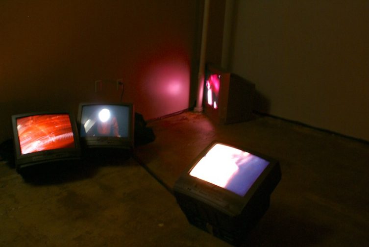
Sadness ….director/designer A multi-monitor video installation featuring 19 crying people Premiered in Brooklyn, New York
Bubbles ….director/designer A multi-monitor video installation featuring people chewing gum and blowing bubbles Premiered in Manhattan, New York
Eunuchs ….designer A multi-wall video installation concerning a tribe of eunuchs in India Premiered in Copenhagen, Denmark
Child Prostitution ….designerA multi-wall video installation concerning child prostitution in India Premiered in Barcelona, Spain
Renaud Muraire
Born in 1972 in Nice, France
Lives and works in Paris.
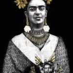
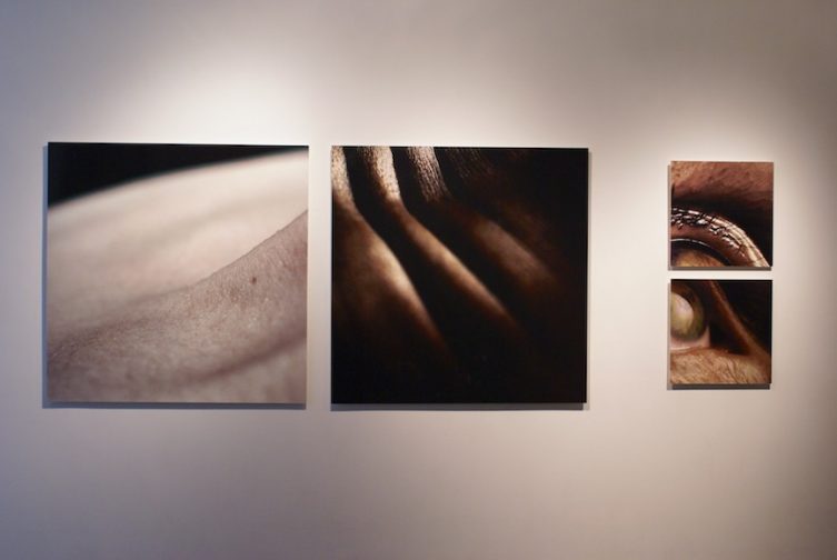
Renaud Muraire portrays modern day women, particularly within their intimacy.
Responding to media’s current codes, he uses representation of beauty and youth to question self-awareness, appearance and society’s demand.
Beyond contemporary preoccupations, beauty thereby embodies something inexplicable: gazes are sharp and flesh is marked, as scars being part of identity. This theatricality of appearance brings us closer to the subjects: spectator becomes voyeur, and privacy leads to a public scene. Closeness then merges with guilt of intrusion.
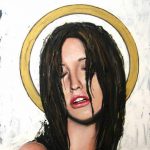
Renaud Muraire’s subjects often express vulnerability mixed with strength and power, which manifests something of our very contemporary age. The shown and expected perfection cannot hide internal feelings. These women seem to be imprisoned behind impossible physical diktats, using their beauty as a lead shield. Renaud Muraire is too haunted by the question of time. His subjects can be regarded as witnesses of external mutation, and the intimate reaction to this change. The consciousness of transience adds a very specific intensity to Renaud Muraire’s work. Through embezzling religious stereotypes (Icons Series), Renaud Muraire then places woman above human, allegory for her central position in today’s society.
Previous exhibitions:
- Private solo exhibition, September 2005, Paris
- Group exhibition, June 9th– July 14, 2006, Cologne (Germany), 3 sites (Gallery Seippel, Heinz Bossert Gallery and French Institute)
Osvaldo Romberg
Born in Buenos Aires, Argentina
Lives and Works in New York, Philadelphia and Isla Grande, Brazil
Selected Individual Exhibitions
Jesus de Buenos Aires,
Kunst Museum, Bonn
Buildings Footprints,
Museum of Modern Art Buenos Aires, Buenos Aires
Framing the Art,
Heike Curtze Gallery, Vienna
The War of the Jews
The Artist Workshop, Tel – Aviv
The Library is Burning
The University of Pennsylvania Library, Philadelphia
2005 Translocations: Architectural Installations, 1980 – 2005, (cat.), PeKA Gallery for Experimental Art and Architecture, Technion, Haifa
Narrative Architectural (1987—2005), (cat.), Musée d’Art Moderne de
Saint Etienne, Saint Etienne
Text, Image, Object (1963 – 2005), (cat.), Van Abbemuseum, Eindhoven
Dear Theo…(the night Van Gogh cried), Galerie Heike Curtze, Berlin
2004 From Paradise to Paradise: A Hypertext about Love in Three Parts,
Julie M. Gallery, Tel Aviv, Israel
2003 From Paradise to Paradise: A Hypertext about Love in Three Parts, Universal Concepts Unlimited, New York
2001 The Library Is Burning (recent books), Jan Van der Donk Gallery, New York
2000 Besame Mucho: A Hypertext About Love (cat.), Domgrabungsmuseum, Salzburg, Austria, and White Box Gallery New York
Retinal-Non-Retinal (cat.), Staedtische Kunstsammlungen, Augsburg
1999 Romberg´s Walks at the Kunsthistorische Museum(cat.), Kunsthistorische Museum, Vienna and Galerie Heike Curtze, Vienna
- Bypass(1972-1997) (cat.), Kunstmuseum, Bonn;
Galerie Hohenthal & Bergen, Munich;
Osvaldo Romberg: A Survey (1974-1997), Stux Gallery, New York
1996 +2000/-2000 Even(cat.), exhibited simultaneously at:
Fundacion Xavier Corbero, Barcelona;
Ludwig Museum, Budapest;
Ludwig Museum, Cologne;
Museum of Modern Art, Odessa;
Pennsylvania Academy of the Fine Arts, Philadelphia;
The Reykjavik Municipal Art Museum, Reykjavik;
Stadtgalerie, Saarbruecken;
Tel Aviv University Gallery, Central Library;
Sudo Museum, Tokyo;
Museum Moderner Kunst, Vienna.
1995 Artist Space, New York: The Return of Martin Steel(prospect)
Galerie Hohenthal & Bergen, Cologne: New Books and Short Stories
1994 Gimel Gallery, Jerusalem: Re-Citing, Books and Short Stories
1993 Museum Moderner Kunst, Vienna: Building Footprints III(cat.)
Sprengel Museum, Hannover: On Scale (cat.)
Fundacion San Telmo, Buenos Aires: La vie en Valise: The Artist as Curator(cat.)
Galerie Heike Curtze, Vienna: New Works
Galerie Schueppenhauer, Cologne: New Works
1992 Galerie Montaigne, Paris: Romberg: The ’70s, the ’80s
1991 The Israel Museum, Jerusalem: Building Footprints(cat.)
MUHKA-Museum of Contemporary Art, Antwerp: Building Footprints II(cat.)
Wilhelm Lehmbruck Museum, Duisburg: On Scale(cat.)
1990 The Jewish Museum, New York: Installations(cat.)
1988 Galeria Julia Lublin, Buenos Aires: Prepictum, Postpictum + Working Drawings(cat.)
1987 Galeria Paolo Figueredo, Sao Paulo (cat.)
1986 Museo de Arte de Sao Paulo: Hybrid Objects and Installations(cat.)
1985 Tibor de Nagy, New York (cat.)
1984 XLI Venice Biennial, Israel Pavilion: Retrospective 1972-1984 (cat.)
Utrecht Museum of Contemporary Art, Netherlands: Drawings(cat.)
Kunstmuseum, Hannover: Osvaldo Romberg und der Merzbau von Kurt Schwitters (cat.)
Galerie Springer, Berlin:From Analysis to Metaphor
1983 Galerie Stadler, Paris
1982 Bauhaus-Archiv-Museum. Berlin: Color Environment
Musee D’Art Moderne, Strasbourg: Mythologies, From Altamira to Manet, An Emotional Analysis of Art History(cat.)
Neue Galerie, Sammlung Ludwig, Aachen: Mythologies, From Altamira to Manet, An Emotional Analysis of Art History (cat.)
1981 Museum des 20. Jahrhunderts, Vienna: Mythologies, From Altamira to Manet, An Emotional Analysis of Art History (cat.)
1980 Tel Aviv Museum, Tel Aviv: Mythologies, From Altamira to Manet, An Emotional Analysis of Art History(cat.)
1979 Galerie Stadler, Paris
1978 Galerie Peccolo, Livorno: Works on Paper
1975 International Cultural Center, Antwerp: Typologies(cat.)
1974 Institute of Contemporary Art, London: Projects
1972 Center of Art and Communication, Buenos Aires: Landscape as Idea (cat.)
Selected Group Exhibitions
2005 Domicile: Privé/Public, installations of “Syzygy III” and “The Last
Machu Pichu”, Musée d’Art Moderne de Saint Etienne, Saint Etienne
2000 Topologies: Weiner, Le Va, Anastasi, Romberg, White Box Gallery, New York
1999 Faith,The Aldrich Museum of Contemporary Art, Connecticut
Plural Speech, White Box Gallery, New York
1998 Tel Aviv Museum: The Seventies
1997 Unmapping the Earth, Kwangju Biennial, Korea.
Transversions,Second Biennial of Johannesburg, South Africa
1995 Venice Biennial: Avant-Garde Walk a Venezia
Artists’ Museum, Mitzpeh Ramon, Israel: White Machu Pichu
1993 Thread Waxing Space, New York: Les Levine, Osvaldo Romberg, Nancy Spero
Museum of Contemporary Art, Wright State University, Ohio: Quotations
1992 Aldrich Museum of Contemporary Art, Ridgefield, Connecticut: Quotations
1991 Helena Rubinstein Pavilion, Tel Aviv Museum of Art: Perspective
1989 Aldrich Museum of Contemporary Art, Ridgefield, Connecticut:Projects, Installations
1985 Kenynklist, Museum voor Schone Kunsten, Antwerp:Kunst in Israel
Wilhelm Hack Museum, Ludwigshafen:Apokalypse
18th Biennial: Sao Paulo:Artistas Convidados
1984 Sprengel Museum, Hanover:Nackt in der Kunst
XLI Venice Biennial:Arte allo Specchio
Kunsthalle, Berlin:Rationalism
1983 Neue Pinakothek, Munich:Three Artists about Monet
1976 Lousiana Museum, Copenhagen:Latin American Art
Curatorial Work
2005 Hermann Nitsch / Die Aktionen: 1962-2003, Slought
Foundation, Philadelphia
Cielito Lindo, Work by Julio Grinblatt, Slought Foundation,
Philadelphia
Co-Curator,Non-Retinal: Kovert Konflagration Kovenant,
Slought Foundation, Philadelphia
2004 The Other Epistemology, Museum of Reproductions, Slought
Foundation, Philadelphia
Me altar’s egoes:An Exhibtion of William Anastasi,
Slought Foundation, Philadelphia
Terror: A Collaboration between an Israeli and a Palestinian,
Slought Foundation, Philadelphia
2003 A Tribute to Coltrane, Co-Curated exhibition, Slought Foundation,
Philadelphia
Unconventional Three-Dimensional, Slought Foundation, Philadelphia
2001 First Blood, Ericson Gallery, Philadelphia
2000 Co-curator, Faith: the impact of religion on contemporary art, Aldrich Museum of Contemporary Art, Ridgefield, Connecticut
1999 Unquiet Urbanism, White Box Gallery, New York
1997 Narrative Sculpture, White Box Gallery, Philadelphia
1991 Paper As Knowledge, Dueren Biennial, Leopold-Hoesch-Museum, Dueren, Germany
Publications
Romberg, Osvaldo, The Inverted Pyramid, Text for the Paper Biennial of Dueren, Germany, 1991
Romberg, Osvaldo, Unquiet Urbanism, exhibition catalog, White Box Gallery, New York, 1999
Romberg, Osvaldo, Art to Art. Life to Life.From “Faith” exhibition catalog, Aldrich Museum of Contemporary Art, 2001
Romberg, Osvaldo, Hidden Texts, From “+2000/-2000, Even” exhibition catalog, 2001
Romberg, Osvaldo, Stupid Like a Painter, Text for Of the Diagram: The Work of Marjorie Welish, Slought Books, Philadelphia, 2003
Romberg, Osvaldo, Unconventional Three-Dimensional, Text for Unconventional Three-Dimensional exhibition, Slought Foundation, Philadelphia, September 2003
Romberg, Osvaldo, Text for Me altar’s egoes:An Exhibtion of William Anastasi, Slought Foundation, Philadelphia, 2004
Romberg, Osvaldo, Text for The Other Epistemology, Museum of Reproductions, Slought Foundation, Philadelphia, 2004
Romberg, Osvaldo, Redemption through Blood: Hermann Nitsch’s Theatre of Orgies and Mysteries, Text for Hermann Nitsch / Die Aktionen: 1962-2003, Slought Foundation, Philadelphia, 2005
Romberg, Osvaldo, Evolution, Revolution, and Cielito Lindo, Text for Cielito Lindo, Work by Julio Grinblatt, Slought Foundation, Philadelphia, 2005
Prizes
1967 Gran Premio de Honor Cordoba, Argentina
1968 Gran Premio Nacional Argentina
1974 Premio Benson & Hedges, Argentina
1992 Prize Sandberg, Jerusalem
2004 Heilman Artist and Lecturer, Swarthmore College, PA
Works in Permanent Collections
MUHKA-Museum of Contemporary Art, Antwerp
Kunstmuseum, Bonn
Museo de Bellas Artes, Buenos Aires
Ludwig Museum, Cologne
Leopold-Hoesch Museum, Dueren
Wilhelm Lehmbruck Museum, Duisburg
The Haifa Museum, Haifa
Sprengel Museum, Hannover
The Israel Museum, Jerusalem
California State University, University Library, Long Beach
Wilhelm Hack Museum, Ludwigshafen
Jewish Museum, New York
Museum of Modern Art, New York
Philadelphia Art Museum, Philadelphia
The Tel Aviv Museum, Tel Aviv
Museum Moderner Kunst, Vienna
Library of Congress, Washington, DC
Burton Silverman
BORN: 1928, Brooklyn, NY
EDUCATION: BA, Columbia University, NY
SELECTED SOLO EXHIBITONS:
2004 Gallery Henoch, New York, NY
2003 RL Foster Gallery, Denver, CO
2001 Total Arts Gallery, Taos, NY
2001 Gallery Henoch, New York, NY
1999 Butler Institute of American Art, Youngstown, OH
& Brigham Young Museum of Art, Provo, UT
1998 Merrill Gallery, Denver, CO
1997 Gerold Wunderlich & Co., New York, NY
1996 The Merrill Gallery, Denver, CO
1996 Gerold Wunderlich & Co., New York, NY
1993 Joseph Keiffer Gallery, New York, NY
1991 Capricorn Galleries, Bethesda, MD
1990 Cudahy’s Gallery, New York, NY
SELECTED GROUP EXHIBITIONS:
2006 The Outwin Boochever Portrait Competition Exhibition, Smithsonian National Portrait Gallery, Washington, DC
2006 Gallery Henoch, New York, NY
2005 Teachers from the Art Students League, Daniel Greene, Burton Silverman, & Sharon Sprung, Gallery Henoch, New York, NY
2005 Art of the 20th Century, New York, NY
2005 USArtists, Philadelphia, PA
2005 San Francisco Int’l Art Expo, CA
2005 Art Chicago in the Park, IL
2005 MA Doran Gallery, Tulsa, OK
2004 US Artists, Philadelphia, PA
2004 Art of the 20th Century, New York, NY
2004Doran Gallery, Tulsa, OK
2004 Gallery Henoch, New York, NY
2004 Delaware Art Museum, Wilmington, DE
2004 National Academy Museum, New York, NY
2003 Art of the 20th Century, New York, NY
2003 US Artists, Philadelphia, PA
2003 Gallery Henoch, New York, NY
2003 National Academy of Design, New York, NY
2002 Gallery Henoch, New York, NY
2001 National Academy of Design, New York, NY
2000 Gallery Henoch, New York, NY
1999 Gallery Henoch, New York, NY
1999 Susan Conway Gallery, Washington, DC
1999 Total Arts Gallery, Taos, NM
1999 Colorado History Museum, Denver, CO
1999 Van Vechten-Linberry Art Museum, Taos, NM
1959-99 National Academy of Design, New York, NY
1979-99 American Watercolor Society, New York, NY
1997 The Ogunquit Museum, Ogunquit, ME
1994 The South Bend Regional Museum, South Bend, IN
PUBLIC COLLECTIONS:
The Anchorage Museum of Art and History, Anchorage, AK
Brigham Young Museum of Art, Provo, UT
The Brooklyn Museum, Brooklyn, NY
The Butler Institute of American Art, Youngstown, OH
Cornell University, Ithaca, NY
The Delaware Museum, Wilmington, DE
Denver Art Museum, CO
The Dillard Collection, University of North Carolina, NC
Hofstra Museum, Hempstead, NY
The Mint Museum, Charlotte, NC
The National Museum of American Art, Smithsonian Institution,
Washington, DC
The National Portrait Gallery, Smithsonian Institution, Washington, DC
The New Britain Museum of American Art, New Britain, CT
The Ogunquit Museum of American Art, Ogunguit, ME
The Parrish Museum of Art, Southampton, NY
The Philadelphia Museum of Art, Philadelphia, PA
The Portsmouth Museum, Portsmouth, VA
The Queensboro Community College Art Gallery, NY
The Rutgers University Museum, Camden, NJ
University of Utah, Salt Lake City, UT
AWARDS AND HONORS:
2006 Jury’s Selection, The Outwin Boochever Portrait Competition, Smithsonian National Portrait Gallery, Washington, DC
2005 Newington Cropsey Cultural Center Award for Excellence in the Arts, New York, NY
2004 Gold Medal, Portrait Society of America
2003 Members Award, Oil Painters of America, Taos, NM
2002 Honorary Doctorate, Academy of Art College, San Francisco, CA
2002 Dong Kingman Memorial Award,
American Watercolor Society Annual
1998 Saunders Waterford Award
1998 The American Watercolor Society Annual, New York, NY
1997 Paul and Margaret Berkelson Prize,
National Academy of Design, New York, NY
1997 Mario Cooper Award,
The American Watercolor Society Annual, New York, NY
1996 Clara Stroud Memorial, The AWS Annual, New York, NY
1992 The Joseph Isidor Medal, NAD Annual, New York, NY
1991 The High Winds Medal, AWS Annual, New York, NY
1991 Smith Distinguished Visiting Professor,
George Washington U., Washington, DC;
1991 Elected Hall of Fame, Pastel Society of America
1990 The Catherine Stroud Memorial Award,
AWS Annual, New York, NY
POSITIONS:
2003-05 Membership Committeer; National Academy of Design
2001-03 Assistant Treasurer; National Academy of Design
1999-01 Member of the Council; National Academy of Design
1992-94 Member of the Council; American Watercolors Society
1976-78 Member of the Council; National Academy of Design
Jean-Manuel Simoes
I was born in 1964, in the suburbs of Paris, France.
From that situation, I got two citizenships French and Portuguese, from my parents and from my birthplace.
After graduating in business and administration I spent few years working in management and trading. I quit on my early thirties.
In 1998, I started a career in photography.
I have been working with major french and western newspapers and magazines (Le Monde, Le Monde 2, Paris Match, Wall Street Journal, Le Figaro, O Expresso, Le journal du Dimanche, Le Figaro Magazine, Focus, L’Express, Télérama, Time Magazine…).
I am represented in France by Editing Agency (Paris), and USA by WpN (New-York).
2007, « Sarkozy, Three years of Photography » at « Visa pour l’Image » Perpignan, France
2007, Nominated Kodal PhotoJournalist
2007, Exhibition Photo 4 Gallery, Paris
2006, « Sarkozy » was nominated at the AFP-Bendrihem price.
2006, « 36,4 » nominated at the AIDDA Paris price.
2006, « Par la fenêtre », nominated at the Kodak Paysage-Architecture price.
2005, « 36,4 » a work on the Paris ringroad was awarded « Prix Spécial du Jury » at the Festival du Scoop d’Angers.
2002, Rwanda nominated at Prix Bayeux war correspondant.
2000, Burundi nominated at Prix Bayeux war correspondant.
Valentin Stefanoff & Nina
Always very minimal with few images, without big special effects, often without text, with a very estimate sound, the common works of Nina Kovacheva and Valentin Stefanoff (mainly video and sonic installation) drive the spectators to pose himself a basic questions about existence in the contemporary world. Many of their recent video installations are intended to the façades of different museums and public buildings. For the video installation “In the Out” which is in the same principle they was awarded a “The 2002 UNESCO Prize for the Promotion of the Arts”.
VALENTIN STEFANOFF
Born: 1959, Sofia, Bulgaria. Lives and works in Paris, France
National Academy of Fine Arts, Sofia. Graduated in 1985
Selected Solo Exhibitions:
2006 -Play for Two Hands and Black, , video installation on the façade of the National Academiy of Fine Arts, Sofia, Bulgaria
-Phases of Accumulation and Extraction in a Limited Space, Musée d’Art Modern et Contemporain, Strasbourg, France
2005 – Au-delà de ce qui est visible, curator Ruxanra Balaci, MNAC, Bucharest, Romunia
– Phases of Accumulation and Extraction in a Limited Space, National Art Gallery, Sofia, Bulgaria
2004 – Au delà de ce Qui est Visible, public project, Paris, France
2003- Currency, Gallery Mabel Semmler, Paris, France
2002 -Experimental Intermedia Galerie, Gent, Belgium
2000- Open – Closed, The Museum of Contemporary Art, Belgrad, Serbia & Montenegro
1999- Identifications of The Space II, Gallery Luc Queyrel, Paris
1997- Day-Box – exhibition “Anonymous” , ATA Centre for Contemporary Art, Sofia
1996- Methods for Self Educations, Galerie de C.I. A. and Galerie de l’Espace Hérault, Paris
1994- 6 x 4 x 16″- Gallery Bernard Jordan, Paris
– Gallery “Graficki Kolektiv, Belgrad, Serbia & Montenegro
– Cultural Centre “Wittgenstein”, Vienna, Austria
1993- 6 x 4 x 16 – Institut Français, Sofia, Bulgaria
1991- Musée des Beaux Arts, Le Locle, Switzerland
1989- Gallery Dogenzaka, Tokyo, Japon
Selected Group Exhibitions:
2006 – -Sometimes the Close is More Open Than Open and Open is More Closed Than Closed, commissaire Karine Vonna,Villa du Parc Centre d’Art Contemporain, France
2005 – Two Asias, Two Europes, curator Gu Zhenqing Shanghai Duolun Museum of Modern Art, China
2004 -Au delà de ce qui est Visible, video installation, Nuit Blanche, Paris, France
-“3.39%”, Macedonian Museum of Contemporary Art, curator Magda Carneci/Maria Vassileva, Thessalonique, Grèce
2003 -Wet Contact, Nuit Blanche, Musée du Montparnasse, Paris, France
– Return Nature II, curator Gu ZhecunqingNanjingShenghuaArts Center, China
-16ès Instants Vidéo de Manosque, Manosque, France
– Video & Digital Art Festival, Novi Sad, Serbia
– One, Several, Many Odyssey – video installation, The Museum of Cinema, Thessalonique, Greece
– Media Art Festival, curator Matrina Grzinic, Maribor, Slovenia
– Export -Import, curator Maria Vassileva, Municipale Gallery – Sofia , Bulgaria
2002- Crossing Time international, Dartington Gallery, Dartington College of Arts, England
– In The Out, 4thBiennial of Cetinje, Curators Iara Boubnova & Andrei Erofeev, Montenegro
– Wet Contact, Kunsthalle Faust, Hannover, Germany
– Mirror of the Balkans, Face -Identity, curator Zoran Eric, National Gallery – Museu, Kraljevu
-Xth Festival Inner Space Multimedia Art «Sound and Image», Poznan
2000 – International Art Forum for Video and New Media, Sofia, Bulgaria
1999- Stocholm Art Fair – Gallery Luc Queyrel
1997 – SAGA-FIAC Edition, Stand Atelier Tanguy Garric, Paris
– Intergrafia ‘97-World Award Winner Gallery, Katowice, Poland
1996 – Seoul Art Fair’96, Stand Tanguy Garric, Seaul, Korea
1995 – The Message of The Sign-Between Letter and Image, Prague-Cracow
1994 – N Forms, Reconstructions and Interpretations- Soros Foundation, Sofia
1993 -XXth International Biennale of Graphic Art, Ljubljana, Slovenia
1992- Chefs d’œuvres de l’estampe du XXème siecle-De Bonnard à Baselitz, The French National Library
1991- Triennial of The Contemporary Arts, New Delhi, India –
1989- L’Europe des Graveurs, Grenoble, France
Prizes and Grants:
2002 – The 2002 UNESCO Prize for The Promotion of The Arts, Paris, France
– Pollock-Krasner Foundation, New York, USA Annual Grant 2002
1995 – Pollock-Krasner Foundation, New York, USA Annual Grant 1995
Nina Kovacheva
Born:Sofia, Bulgaria, lives and works in Paris, France
Schools:National Academy of Fine Arts, Sofia, Bulgaria. Graduated in 1985
One person shoxws (selection):
2006 -Play for Two Hands and Black, video installation on the façade of the National Academiy of Fine Arts, Sofia, Bulgaria
– Phases of Accumulation and Extraction in a Limited Space, Musée d’Art Modern et Contemporain, Strasbourg, France
2005-Au-delà de ce qui est visible”, curator Ruxanra Balaci, MNAC, Bucharest, Romunia
-Phases of Accumulation and Extraction in a Limited Space, National Art Gallery, Sofia, Bulgaria
2004 – Au-delà de ce qui est Visible, outdoor installation, Paris, France
-Vidéo Retrospectif, curator Karine Vonna, Maillon – Wacken, Strasbourg, France
2003 – Currency, Gallery Mabel Semmler, Paris, France
2002 –Wet Contact, Experimental Intermedia Gallery, Gent, Belgium
2001- Approche, Gallery Luc Queyrel, Paris, France
-Approche, Galerie Haos, Belgrade, Serbia
1998 – Sometimes… – Gallery Luc Queyrel, Paris, France
Group shows (selection):
2006-Important Announcement, curator Maria Vassileva, Galerie Municipale d’Art, Sofia, Bulgaria
-Voiler/Dévoiler, curator Karine Vonna, Villa de Parc, Contemporary Art Center, Annemasse, France
-I am the Best, Les petits délices, curator Brent Klinkum, Caen
– 28e Festival International, Films de Femmes, Maison des Arts, Créteil Val de Marne
2005 – Two Asias, Two Europes, curator Gu Zhenqing, Duolun MOMA, Shanghai, China
2004 – Au-delà de ce qui est Visible,Nuit Blanche, Paris France
-0.039225, Cosmopolis, curator Magda Carneci Macedonian Museum of Modern Art, Thessaloniki, Greece
– Falutriennalen , Dalanas Museum, Falun, Sweeden
2003- Return Nature II, NanjingShenghuaArts Center, curator Gu ZhenqingChina
-Wet Contact, Nuit Blanche, Musée du Montparnasse, Paris, France
-One, Several, Many Odyssey, video installation, The Museum of Cinema, Thessalonique, Greece
-16ès Instants Video de Manosque, Manosque, France
-Export -Import, curator Maria Vassileva, Municipale Art Gallery – Sofia, Bulgaria
-9thInternational Festival of Computer Arts, curator Marina Grzinic, Maribor, Slovenia
- – Kunsthalle Hannover, curator Harro Schmidt,Germany (catalogue)
– In the Out- video installation, curator Iara Boubnova ,4thBiennial for Contemporary Art, Cetinie Montenegro
-Musée de l’Erotisme, Paris, France
– Mirror of the Balkans, Face-Identity, curator Zoran Eric, National Museum, Kraljevu
2000 – The National Museum of Women in the Arts,Washington DC, USA
2002 – The 2002 UNESCO Prize for The Promotion of The Arts, Paris, France
1998 – Pollock-Krasner Foundation, New York, USA Annual Grant 1998