POISE AND PUNCHLINE

POISE AND PUNCHLINE
POISE AND PUNCHLINE

Korean Contemporary Art

POISE AND PUNCHLINE

September 11 – November 7, 2026

Venice, Italy

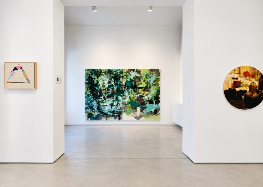
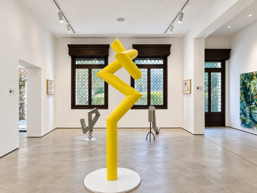
Poise and Punchline presents a polyphonic exploration of contemporary Korean aesthetics through seven distinct artistic voices, each a master of their own narrative. Curated by Dr. Jennifer Baahng, the exhibition responds to the 61st La Biennale di Venezia’s overarching theme, In Minor Keys, by examining the interplay between Gyeok-jo (dignified restraint) and Hae-hak (subversive wit). It explores the “K-Core”—a deep-rooted philosophical foundation of Korean art, the resilient, lower-frequency philosophies that underpin Korean creative persistence. The featured artists, working across sculpture, installation, and painting, demonstrate that humor and refinement are not opposites but unified tools for social critique and emotional resonance. These seven South Korean artists maintain a sovereign poise while delivering punchlines that pose a vital challenge and contribute to the discourse of global contemporary art.

ARTISTS

Hank Kim

Jean Jinho Kim

Stephanie Kim

Bone Koo

Meera Lee

Jaye Moon

Special presentation by Joshua Lantern

WATCH THE VIDEOS

Hank Kim
Hank Kim

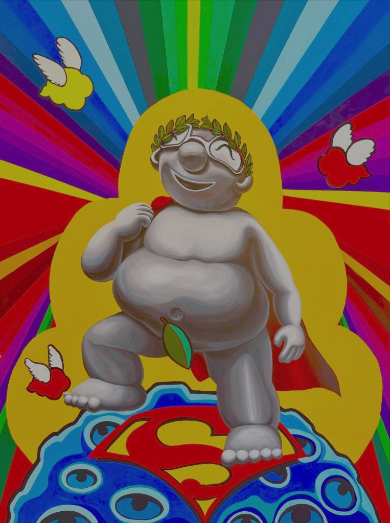
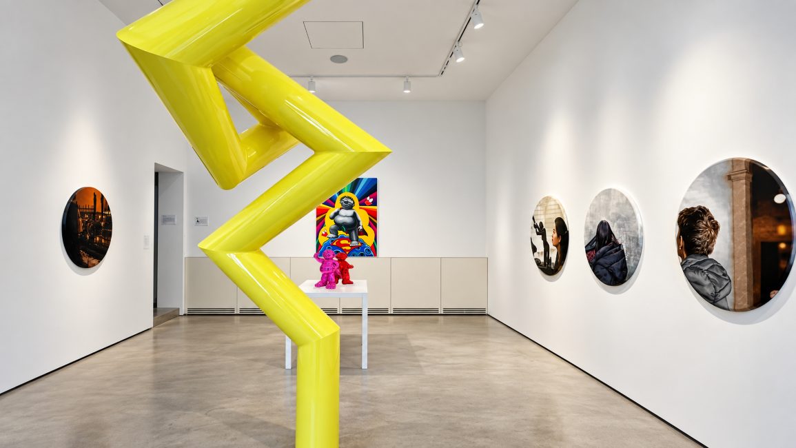
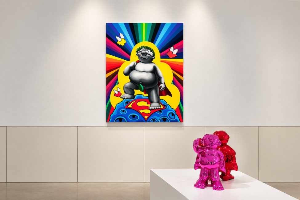
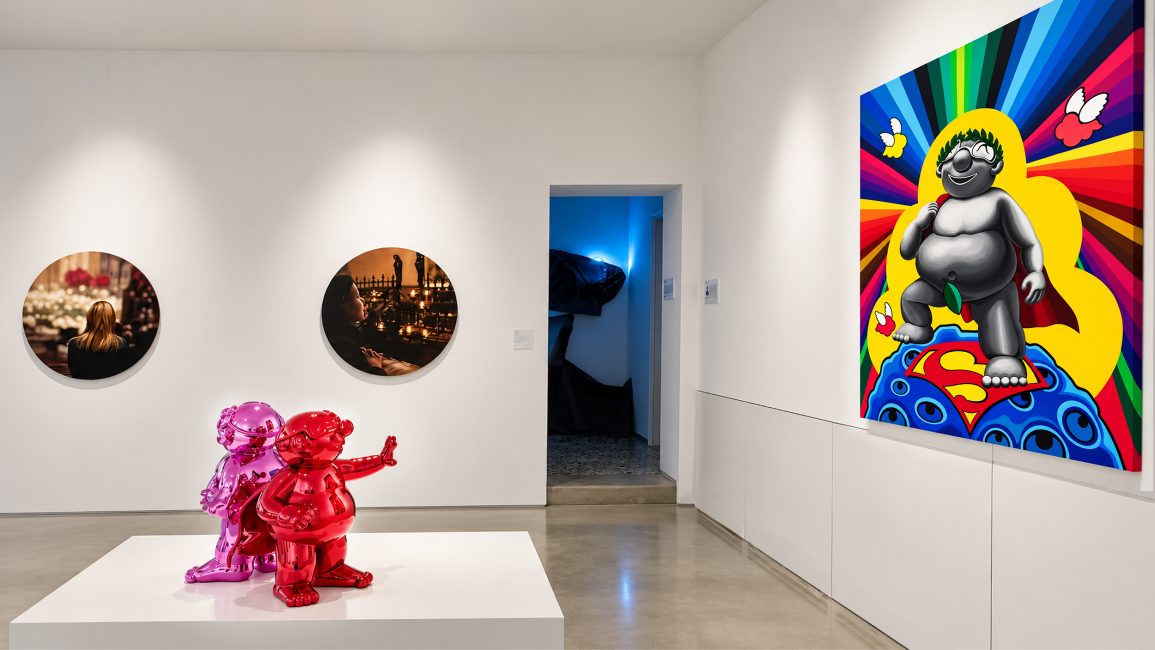
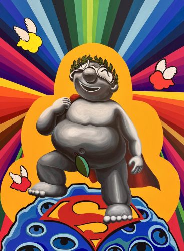
Hank Kim (b. 1972)’s art is rooted in “Everyday Life Aesthetics,” drawing on vernacular histories and blending personal perspectives. Super Babies are on view, configured in bold proportions with sharply defined silhouettes. The aesthetic employs a minimal vocabulary to explore symbols of power. Through solid forms rendered in vibrant colors on sleek, durable surfaces, Kim distills ideas and references into basic forms. Whimsical and highly sculptural, these animated cels become relics of moments such as a single flight or eventual arrival. Minwha is a Korean folk art genre from the late Joseon Dynasty that subtly mocks the rigid aristocracy through lively colors and humor. Kim grafts these traditional Korean Pop Art motifs into modern sculpture—honest depictions of daily life and a desire to transcend reality as a superman. This anti-hero manifests his journey as an immigrant, family man, and artist. Kim’s work is built on memories of Danchung and the Obangsaek—the Korean five-color scheme. It represents a collective desire for cosmic harmony, stability, and peace, incorporating Western art influences and American Pop Art. It also reflects his embrace of life’s mud, a Japanese notion of wabi-sabi—finding beauty in imperfection—and Nietzsche’s Übermensch, which seeks self-mastery and dominance. While Kim’s approach champions life’s humble beauty, it ultimately points to hope and positivity. David Super Baby echoes in its vividness and flatness an arc toward a contemporary aesthetic. Hank Kim has held numerous solo exhibitions and has participated in over 300 group exhibitions. He earned a BFA in painting from Suwon University, an MFA in painting from Sungshin University, and an MFA in sculpture from Lehman College, CUNY. He lives and works in New Jersey.
Hank Kim

Hank Kim (b. 1972)’s art is rooted in “Everyday Life Aesthetics,” drawing on vernacular histories and blending personal perspectives. Super Babies are on view, configured in bold proportions with sharply defined silhouettes. The aesthetic employs a minimal vocabulary to explore symbols of power. Through solid forms rendered in vibrant colors on sleek, durable surfaces, Kim distills ideas and references into basic forms. Whimsical and highly sculptural, these animated cels become relics of moments such as a single flight or eventual arrival. Minwha is a Korean folk art genre from the late Joseon Dynasty that subtly mocks the rigid aristocracy through lively colors and humor. Kim grafts these traditional Korean Pop Art motifs into modern sculpture—honest depictions of daily life and a desire to transcend reality as a superman. This anti-hero manifests his journey as an immigrant, family man, and artist. Kim’s work is built on memories of Danchung and the Obangsaek—the Korean five-color scheme. It represents a collective desire for cosmic harmony, stability, and peace, incorporating Western art influences and American Pop Art. It also reflects his embrace of life’s mud, a Japanese notion of wabi-sabi—finding beauty in imperfection—and Nietzsche’s Übermensch, which seeks self-mastery and dominance. While Kim’s approach champions life’s humble beauty, it ultimately points to hope and positivity. David Super Baby echoes in its vividness and flatness an arc toward a contemporary aesthetic. Hank Kim has held numerous solo exhibitions and has participated in over 300 group exhibitions. He earned a BFA in painting from Suwon University, an MFA in painting from Sungshin University, and an MFA in sculpture from Lehman College, CUNY. He lives and works in New Jersey.
Jean Jinho Kim

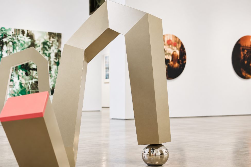
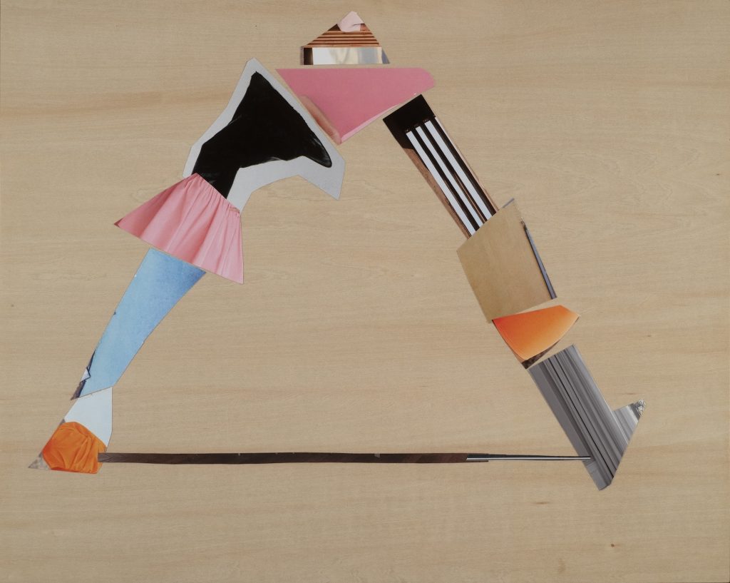
Jean Jinho Kim (b. 1956) investigates formal abstraction through diverse works, from inventive collages to large steel structures. Her core themes of transformation and empowerment are expressed through metal bending and minimal abstraction. She continually refines her work for greater directness and impact. Shall We? examines perception, exploring surface, color, and scale. A complex interplay of time and space, the sculptures draw viewers into moments of heightened imagination. Like drawing in the air—fluid, elegant, and monumental—they showcase precise geometry balanced with essential sculptural intensity. Recurring fragmentation and flow lend Kim’s architectural forms a playful quality. Her collages exemplify a rare confluence of components that cohere seamlessly. Hold My Hand, The Open Circle, and Power House are constructed from layered, malleable materials, with subtle references to their inherent qualities that balance poise and wit. With attention to material, composition, and emotional depth, Kim invites the viewer into a calm yet expressive space—a disciplined creative spirit. Culminating in a humanistic space, her art equilibrates control and collapse, restrained yet passionate, and emphasizes spatial texture with noble sensitivity. Jean Jinho Kim contemplates the next frontier: understanding time, space, and the human psyche. Holds a BFA in painting from West Virginia University and an MFA in Studio Art from American University. Her institutional exhibitions include the Incheon Open Port Museum, the Katzen Museum, the Gilchrist Museum of the Arts, the Kreeger Museum, the Korean General Consulate, and the Phillips Collection in Washington, D.C. She lives and works in Washington, D.C.
Stephanie Kim

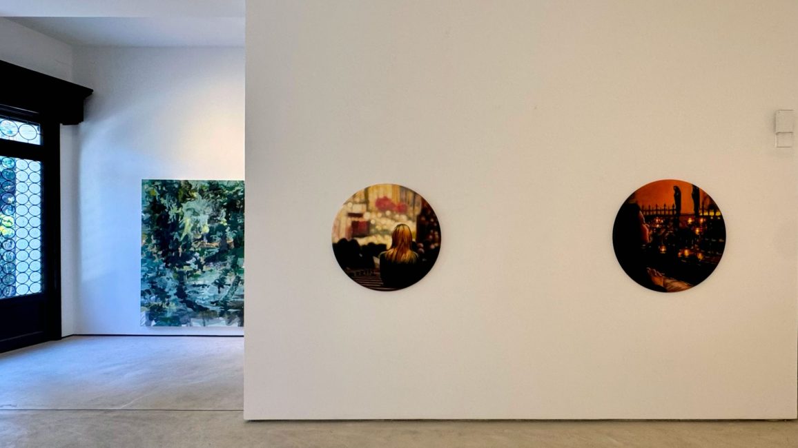
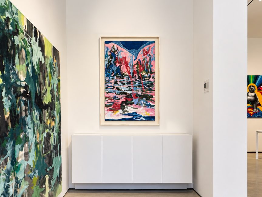
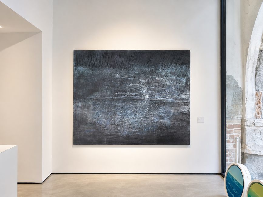
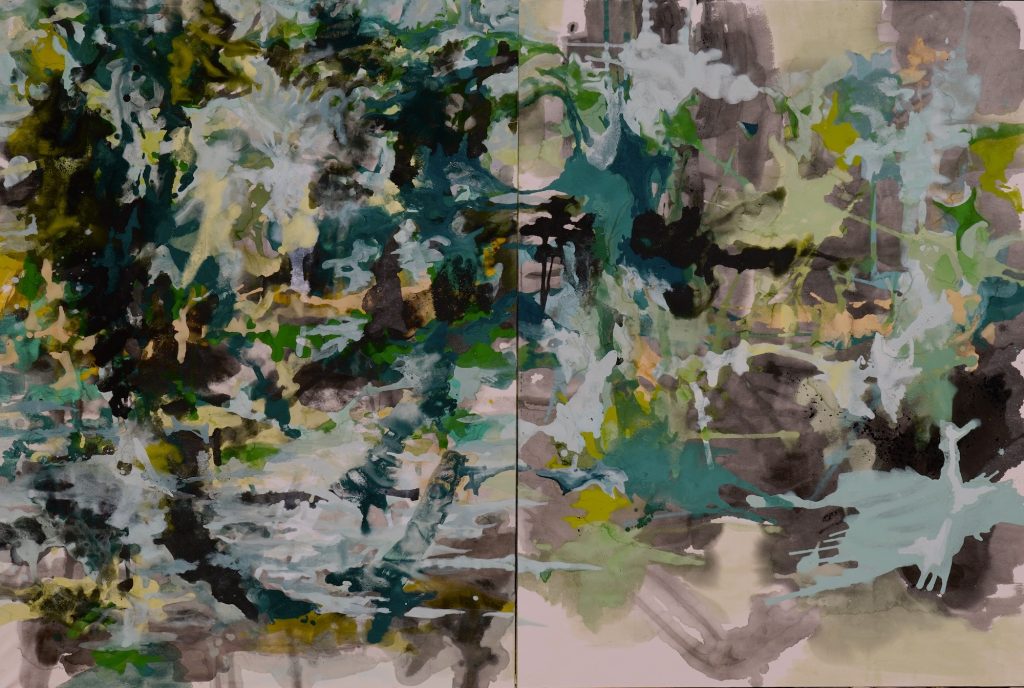
Stephanie Kim (b. 1971) draws poetic connections among memory, nature, and identity. With erotic nuances in entangled creatures, she creates breathtaking abstract paintings, especially landscapes mirrored in water. True nature reveals a different realm—an unstable blend of light and motion. With gradations of ink and the tactile vulnerability of Hanji, Korean mulberry tree paper, she traces the fleeting moments in life, which are in continual flux. In Resonance, expressive color markings invite us to step beyond the shore’s sly allusions and immerse ourselves in a nature distilled to its essence. She hopes viewers will reconnect with a version of themselves that is both whole and healed. Kim’s art is an immersive poem that processes emotional intensity. It builds complex surfaces using Meok, traditional East Asian ink, and Bunchae, powdered pigments. Fragments, transience, rich textures, and deep shadows in semi-monochromatic palettes highlight her primal instinct as an artist. Ostensibly, Resonance is splendid in form—color is the brick and mortar of a dementedly joyous transformation. Patterns repeat in the space, and massive abstract markings are filled with shifting, puzzle-like shapes and lines. Kim’s ultimate muse is the exploration of light, reflection, and shifting atmospheric conditions. Her markings serve as the structural building blocks of abstract compositions. With early art training at Sunhwa Arts Middle and High School, Stephanie Kim earned both a BFA and an MFA in Oriental Painting from Ewha Womans University. After earning a Digital Design Certificate from the Art Institute of Pittsburgh in the U.S., she has exhibited in New York, Dallas, Miami, and Seoul. She lives and works in New Jersey.
Bone Koo

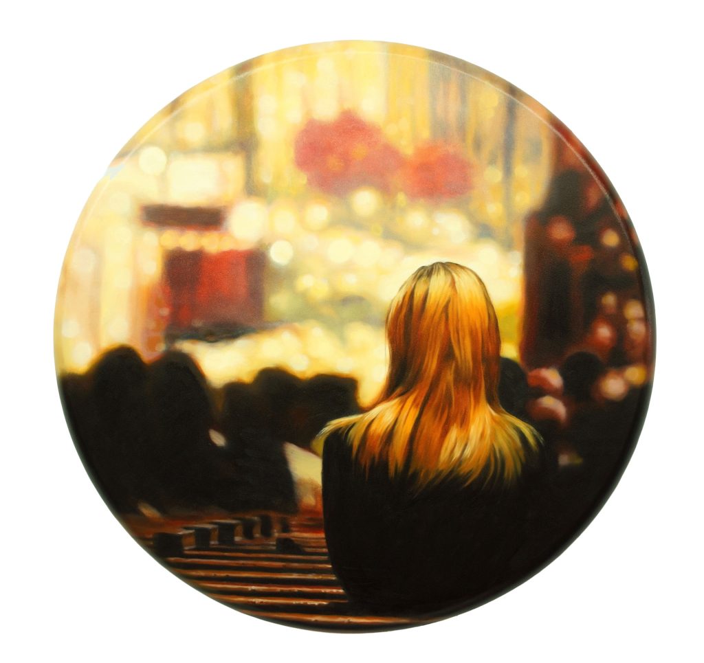
Bone Koo (b.1973)’s art is a self-help monologue. It is a devotional narrative that reconstructs states of heightened awareness. Alluding to the spatial clarity of Renaissance paintings, Koo’s paintings have surfaces disrupted by blurring, diffusion, and painterly instability. It is a supreme poetry, with its melancholy, splendor, and celestial sound. The five atmospheric oil tondo paintings, Benedictions, are mind-scapes. They strip away the layers of a persona to reach the spirit of the painting: an ultimately divine moment felt by the subject in the picture, by the maker Koo himself, and by the viewer. Koo’s paintings blend realism with the conceptual freedom of surrealism—flawless detail is rendered with extreme, photographic accuracy, while subtle foreshortening in light, scale, or object combinations defies reality. Benedictions emerge through cinematic mood in scenes that often feel overly sterile, eerie, or dreamlike, prompting the viewer to question what is real. They chronicle the human condition, conveying a specific, intimate sensation of being alone. A nod to Vermeer and Rembrandt, Koo frames his paintings in psychological realism. He prompts viewers to slow down and arrive at a state of being present—a slower pace yields a more intuitive experience of the pictorial planes. Koo paints from the photographs he takes of live subjects. He then deliberately blurs the boundary between realism and abstraction across the pictorial plane. The intent is to depict the ineffable: His work becomes a myth, indecipherable. Bone Koo earned a B.F.A. from Hongik University and a Master of Divinity from Drew Theological School. He runs an art academy that fosters early artistic skills. He lives and works in New Jersey.
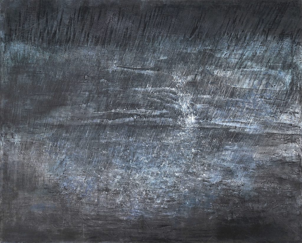
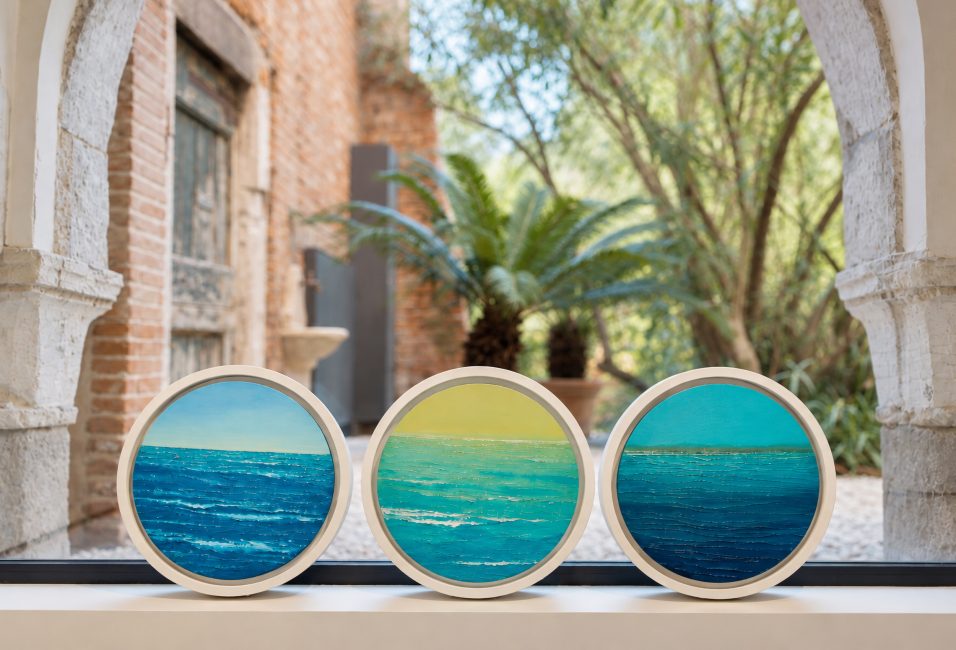
Meera Lee (b. 1962) captures the rapture she feels when she paints, a confessional. Her works depict frolics that reach uninhibited joy and lighthearted celebration. She has long used dynamic techniques to translate this energetic spirit onto canvas. She floods these scenes with warm, vibrant sunlight or night-hour glows to amplify the uplifting emotional tone. The Cruise paintings are seascapes that offer intimate, private moments, peering into the vastness through a vernacular lens. These brief scenes allow us to experience fleeting beauty and impermanence. They may seem random, but they are deliberate: the tunnel walk, a mainstay of Lee’s art. At Dawn simmers across undulating sea terrain, calling out to the introspective. It is a blossoming spiritual landscape. Still yet choppy, it has a visceral appeal for cinephiles, as if it has a story to tell. The Coast, a mind-scape of light and color, is an archetypal Impressionistic painting—rapid, unposed movement rendered in loose, energetic brushstrokes. Her main media attest to this: pastel, charcoal, Seokchae, mineral pigments, Dak-ji, Korean mulberry paper, acrylic paint, tissue paper, paper string, a glue gun, and a sponge. The work becomes a lyrical poem that is not merely terrain but an infinite source of inspiration, constantly reinterpreted through the viewer’s gaze and inner self. Evoking divinity and infinity, isolation and connection, and nearness and transience, her work humbles us and embraces us. Meera Lee earned a BFA and an MFA and taught high school art for 32 years. She exhibited in Seoul, Busan, Paris, Japan, Germany, and Switzerland, and at Gyeomjae Jeongseon Art Museum, Yesong Art Museum, SAGA Prefectural Museum of Art, Maru Art Center, Yeouido National Assembly Gallery, and Tokyo Metropolitan Art Museum Exhibition. Currently a member of the Korea Artists Association, Korea Christian Artists Association, and BARA Art Mission, Meera Lee lives and works in Seoul.

Jaye Moon

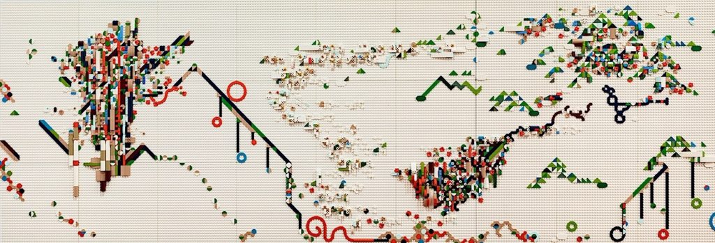
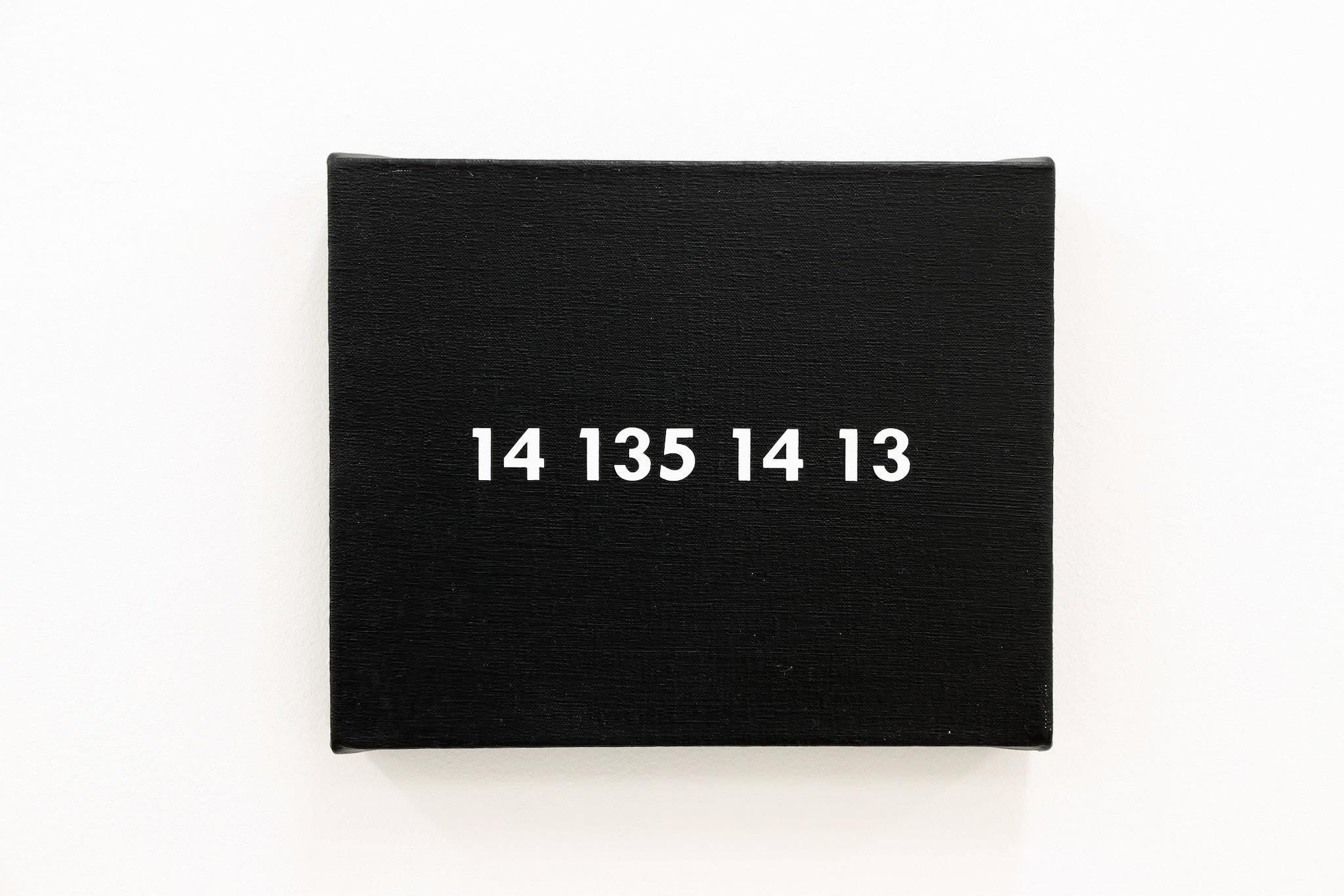
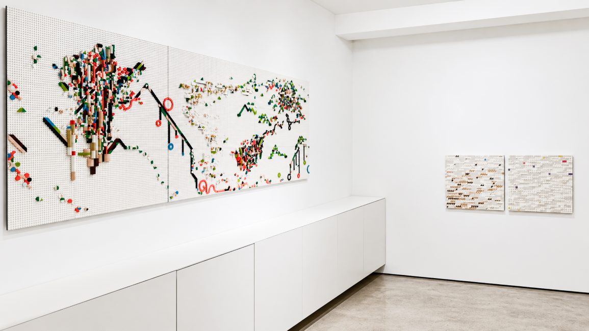
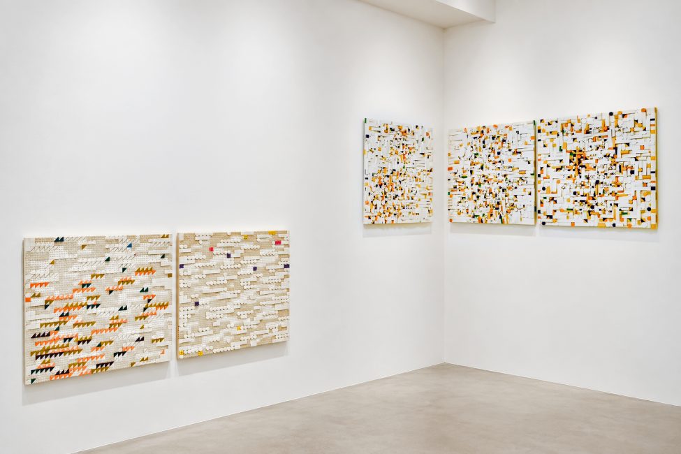
Jaye Moon (b. 1963) crafts interactive Braille paintings with LEGO bricks. Her paintings demonstrate an innovative approach to accessible art, emphasizing inclusivity and tactile engagement. An abstract painting, it is for all viewers, whether or not they can decipher Braille. Dorihwaga (Song of the Peach and Plum Blossoms) is a Pansori, Korea’s traditional genre of musical storytelling. As an oral tradition, Pansori was documented by Shin Jae-hyo, a 19th-century Korean composer, transforming ephemeral performance into a written archive. These efforts ensured the survival of a living art form while preserving its cultural memory. Equally significant was his support of Jin Chae-seon, which expanded possibilities for women Pansori singers. Visual and tactile elements transform Dorihwaga into an abstract sensory experience, allowing sound, language, and memory to be encountered through both vision and touch—a tactile Braille painting echoes the performance’s expressive cadence. Before Rain is an excerpt transcribed from the classic 1952 short story “Rain Shower” by Hwang Sun-won. Presented as a non-tactile Braille painting, here Braille becomes an abstract visual system: translated into numbers, then transformed into geometric forms, color, and rhythm. Restrained compositions reflect the stillness before the rain, manifesting a moment’s fragile beauty. History resonates deeply with Moon’s artistic practice. Tactile or non-tactile surfaces preserve memory, knowledge, and cultural expression, allowing them to be reimagined. Moon’s extensive museum exhibitions include the Brooklyn Museum, the Queens Museum, the Nam June Paik Art Center, the National Museum of Modern and Contemporary Art of Korea, and the Gyeonggi Museum of Modern Art in Korea, as well as solos in Brussels, London, Madrid, Mexico City, Miami, New York, Seoul, and Tokyo. Her work has been reviewed in Art in America, Artforum, Artnet, Time Out, and Newsweek Magazine. Her Braille work was featured in the Korean middle school art textbook. A recipient of the Pollock-Krasner Foundation Grant and holder of an MFA in Sculpture from Pratt Institute, Jaye Moon was the 2025 Hall of Fame inductee of the New York Foundation of Art. Lives and works in New York.
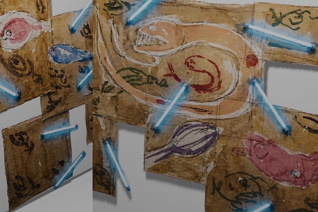
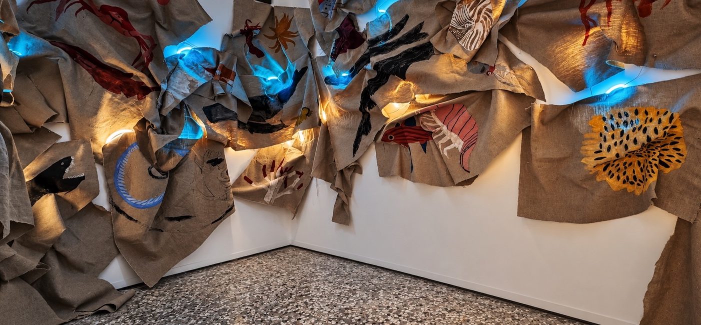
Joshua Lantern (b. 2009) depicts deep-sea creatures—marine animals that have evolved to survive the extreme conditions of the ocean’s midnight and abyssal zones. Operating under crushing pressure, near-freezing temperatures, and perpetual darkness, these animals have developed unique biological structures and visual adaptations to navigate their extreme habitat—bioluminescence turns the deep sea into a constellation of living signals. Faint flashes and subtle emissions become the language for communication, disguise, and survival. The Abyss is a room installation by Joshua Lantern, a Korean-descent artist and the exhibition’s youngest participant. It portrays the secret, luminous world of deep-sea creatures through drawings, collages, and LED lights. The installation is a poetic metaphor for perception, adaptation, and the inner world. It is a dreamscape with a low-frequency sense; these deep-sea ecosystems operate outside the realm of everyday visibility, recognizing one another through signals and rhythms that are rarely detected. It conjures a darkness that is not empty but another ecosystem full of subtle light. These biological strategies are expanded into metaphors of human existence. At a moment when our social and ecological crises are also crises of awareness and imagination, Joshua offers a speculative visual language that approximates the world’s complexity and provokes conversation about eco-politics and eco-culture. Elegant and cruel, this immersive installation places viewers in vignettes of rising global sea levels, the climate crisis, and endangered species; it interrogates reality and inspires humans. The Abyss brings a soft touch to the discourse on environmental justice. Recipient of 1st Place at the Connecticut Junior Duck Stamp Competition and the 2025 New Jersey State Senate Art Award, Joshua Lantern was included in the Top 12 and earned 1st Place nationally at the 2026 Fish Art Contest. He lives in Connecticut.

Categories: exhibitions

Tags:

THE CORPSES

THE CORPSES Light Years Away

Light Years Away

Laura Bell and Ian Ganassi

July 15 – August 30, 2026

WATCH THE VIDEOS

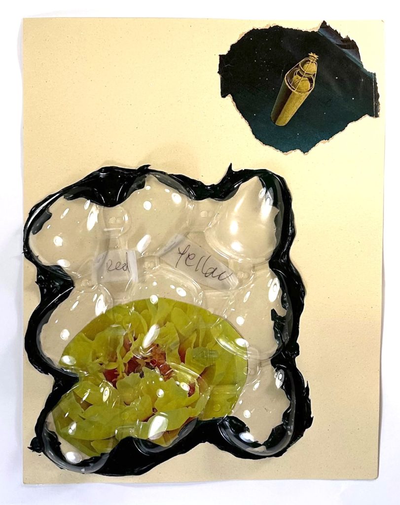
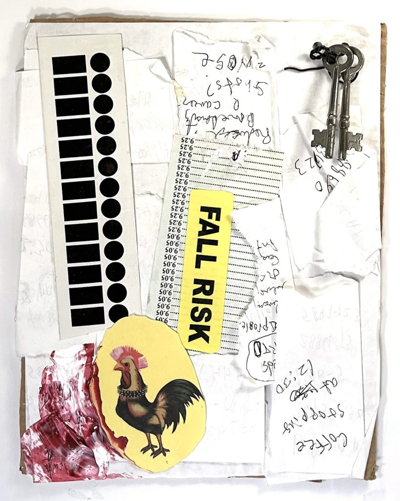
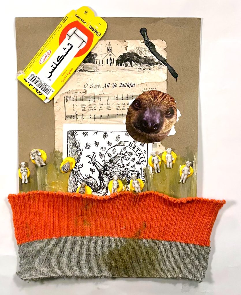
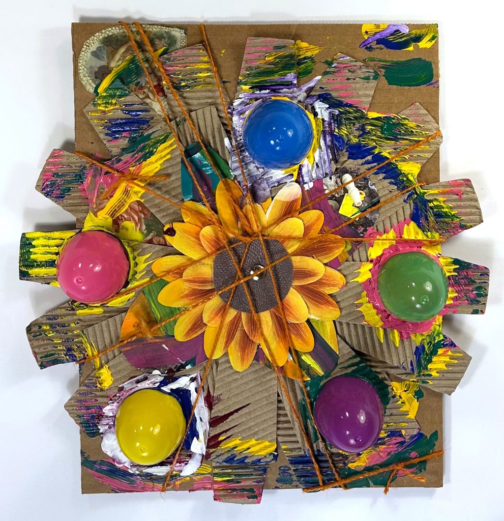
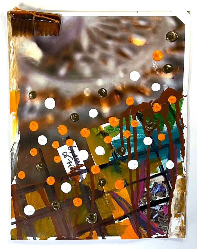
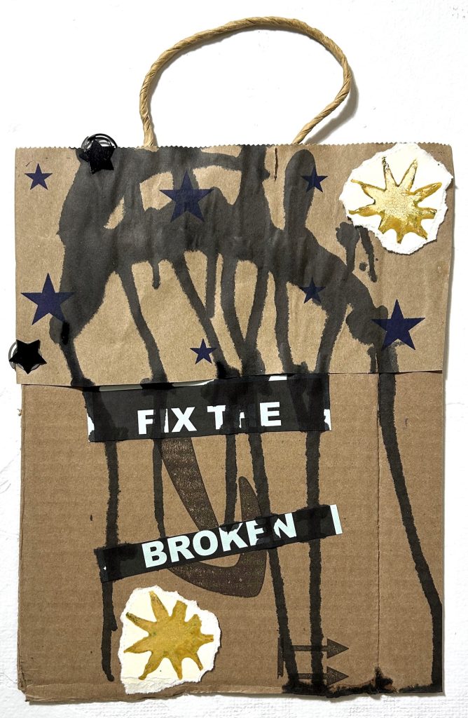
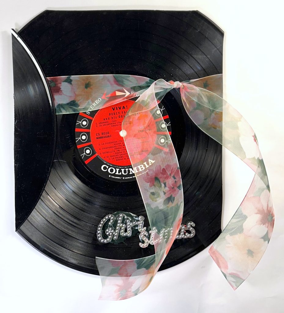
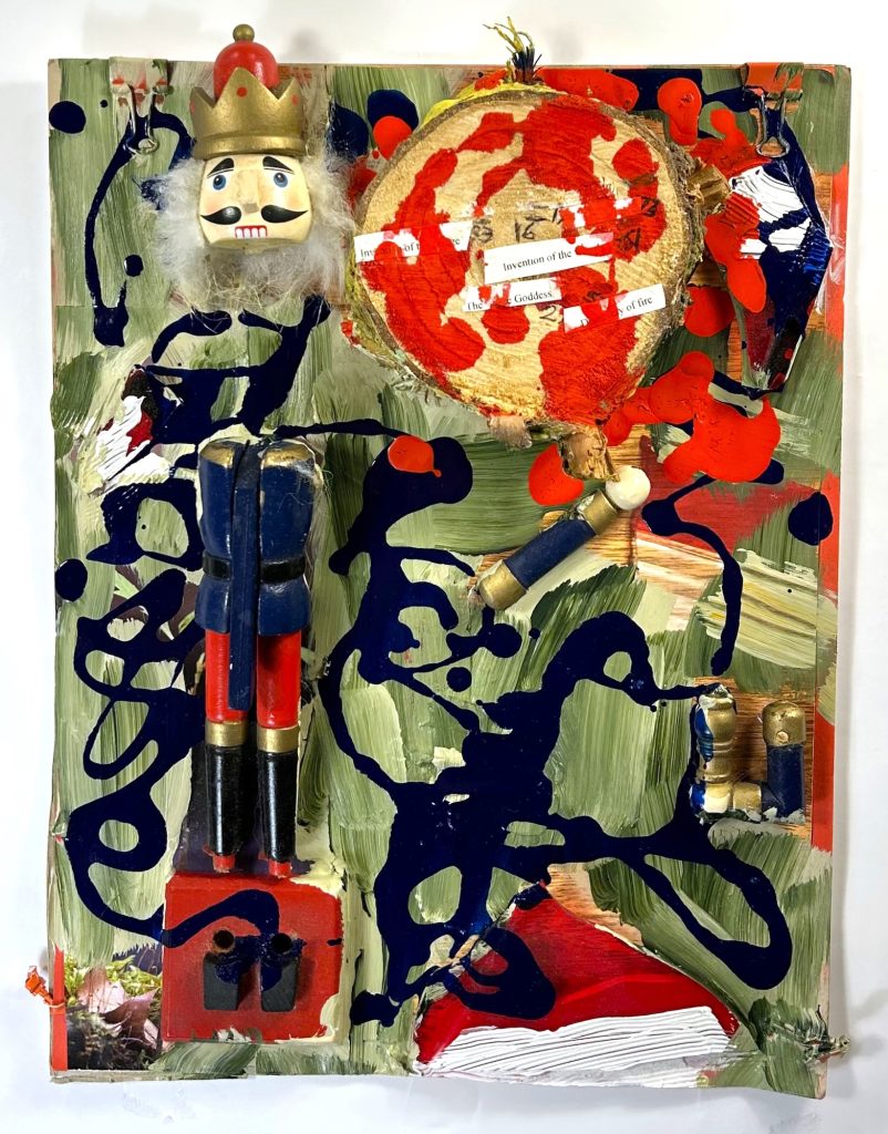
Laura Bell, a painter based in the Bronx, and Ian Ganassi, a poet in New Haven, met as artists-in-residence at the Millay Colony. In 2005, Ian mailed Laura an unfinished poem and handwritten phrases on a sheet of printer paper stained with coffee rings, and in an accompanying letter asked her to do something with it. This became the first move in what evolved into their collaborative collage series THE CORPSES, named after the Surrealist game Exquisite Corpse. Pop culture, politics, religion, and poetry made appearances, and recurring images and phrases created echoes and connections across the works. A collage might have traveled back and forth many times or made only one circuit between New Haven and New York City. The pieces were either minimal or layered; early works tended to be more spare, while later works often gathered more objects, though this tendency ebbed and flowed over the years. Some pieces developed themes or functioned almost as diaries (a hospital glove, a postcard), and time frames could be found in political references. The gathering of materials became a consuming habit, combining found objects, text, drawings, ads, photos, fabrics, and all manner of mixed media—a painterly, visceral process, the anti-Photoshop. Beyond collaboration, THE CORPSES reflects a conspiratorial imagination, sustained over two decades of personal and material call-and-response between painter Laura Bell and poet Ian Ganassi. The round of moves among colleges continued until Ian’s death in September. Light Years Away showcases selections from the final batch.

Categories: exhibitions

Tags:

WE ARE THE LAND

WE ARE THE LAND

Yang SoonYeal

Forbidden Fruits

May 19 – June 30, 2026

WATCH THE VIDEOS

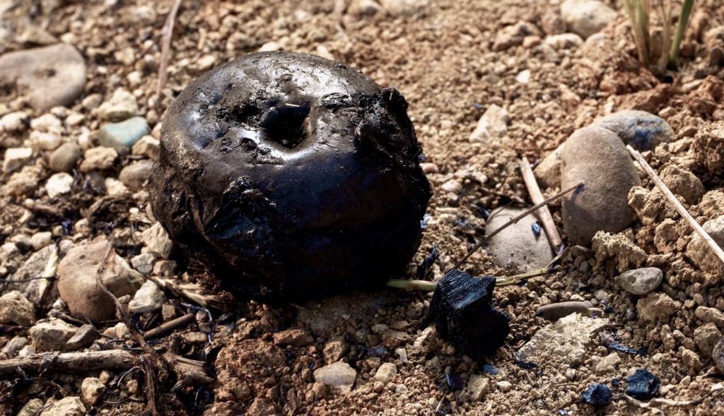
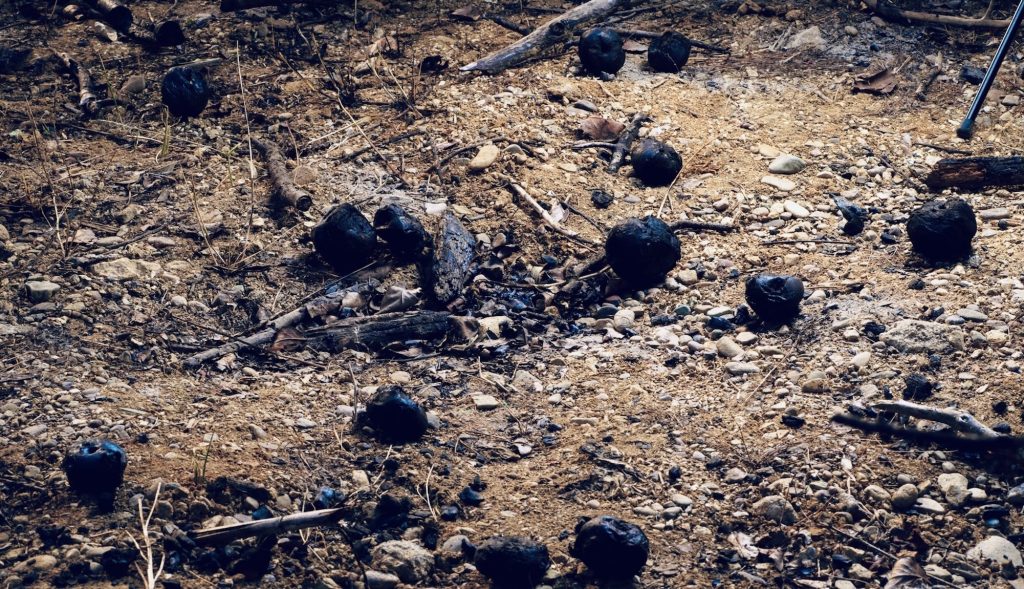
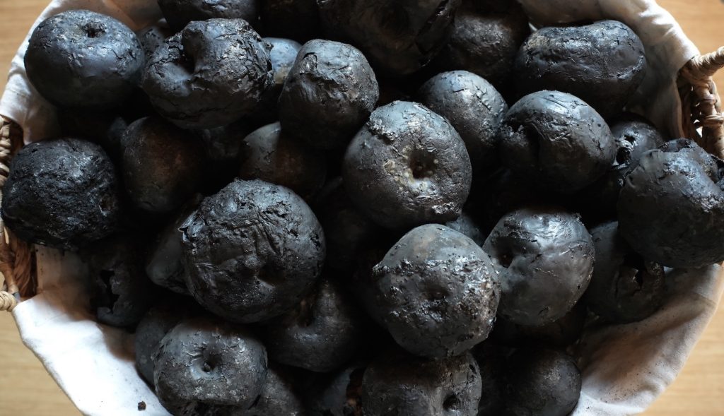
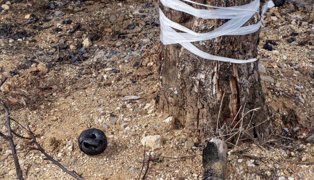
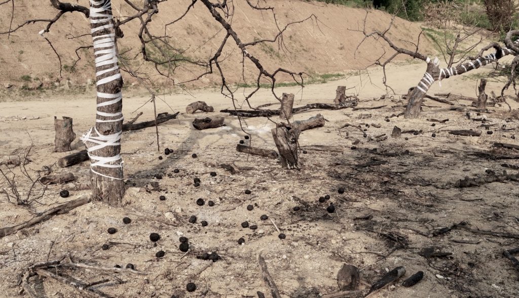
JENNIFER BAAHNG’s curatorial initiative WE ARE THE LAND presents Forbidden Fruits, which explores the complex relationship between human actions and the physical environment through Yang SoonYeal’s burnt apples collected after a 2025 wildfire in South Korea. The online exhibition illustrates ecological and domestic destruction, revealing how human actions scar the land. Forbidden Fruits is a social sculpture, a transformative artistic concept coined by Joseph Beuys in the 1970s, which proposes that society itself is a collective artwork shaped by individuals’ creativity, actions, and thoughts. “Everyone is an artist,” in structuring society, fostering dialogue, and enacting social change. Showcasing charred apples as art shifts the focus from the aesthetic perfection of traditional fruit paintings to the messy, often overlooked processes of change and loss. Forbidden Fruits is a living sculpture, a Gesamtkunstwerk that focuses on transformation, transience, and the imperfections of reality.

In the humanities and visual culture, the apple shifted from a strict scriptural code to a dynamic vector for formalist, phenomenological, and semiotic experimentation. Originally bound to a Latin philological pun (malus denoting both fruit and evil), the motif long cast the apple as a rigid biblical archetype of original sin. Modernism, however, dismantled this theological shorthand to interrogate human consciousness and perception. Within still-life painting, the apple became a primary laboratory for radical innovation: Cézanne deployed the fruit to shatter Renaissance perspective, introducing a multi-perspectival geometry that undergirded Cubism. Van Gogh subsequently leveraged the motif to exploit simultaneous contrast, privileging visceral, chromatic expressionism over mimesis. Inverting this painterly lineage, Magritte engineered an aesthetic disruption that exposed the semiotic instability of the visual image. By decoupling the signifier from the signified, Magritte’s deadpan treatment bypassed traditional aesthetics, forging the intellectual matrix that codified Conceptual Art and the mass-media ironies of Pop Art.

Extending this trajectory from the gallery wall into contemporary eco-discourse, introducing Forbidden Fruits into Land Art offers a profound thermodynamic critique of the Anthropocene, staging an intellectual convergence among history, culture, and the physics of ecological ruin. By subjecting the apple to the entropic violence of fire, Land artists perform a literal and symbolic decolonization of the landscape. The blackened apples function as a site-specific archive of pyrocene trauma, in which the orchard’s domestic comforts are violently reclaimed by elemental, unruly natural forces. Structured within the landscape, these carbonized spheres evoke the geological minimalism of Robert Smithson and the ephemeral cyclicality of Andy Goldsworthy, serving as a visceral memento mori. This practice establishes a compelling material dialectic: the scorched apple is both a relic of total destruction and an essential biological nutrient that fuels future micro-ecosystems. Ultimately, this framework redefines the burnt apple from a passive object of aesthetic decay into an active, political agent of generative ruin, exposing the fragile, porous boundaries between human cultivation and climate-induced collapse.

WE ARE THE LAND: Forbidden Fruits bridges material alchemy, classical mythology, and contemporary socio-ecological collapse. Yang SoonYeal’s practice orchestrates an ultimate semiotic rupture by upending the apple’s historic iconography as the fruit of paradise, refracting it instead through the lens of environmental destruction. As a living monument to the Pyrocene, these carbonized spheres crystallize the literal memory of climate trauma. The burnt apples are conceptually diamondized into hardened, permanent sculptures—simultaneously beautiful and horrific—that transmute an ephemeral eco-catastrophe into a haunting, static aesthetic object. Operating as a Beuysian social sculpture, Forbidden Fruits fosters active ecological literacy by linking anthropogenic action directly to systemic planetary health. Foraging among these contemporary ruins, Yang laments the collapse of a stable Holocene world while seeking a persistent impulse within the ash, the green buds of an Earth sprouting from the site of its own destruction.

Categories: exhibitions

Tags:

INDETERMINACY

INDETERMINACY

John Cage: Works on Paper

March 5 – April 22, 2026

WATCH THE VIDEOS

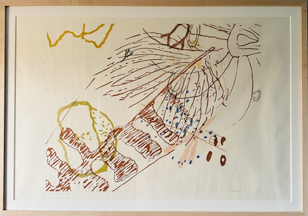
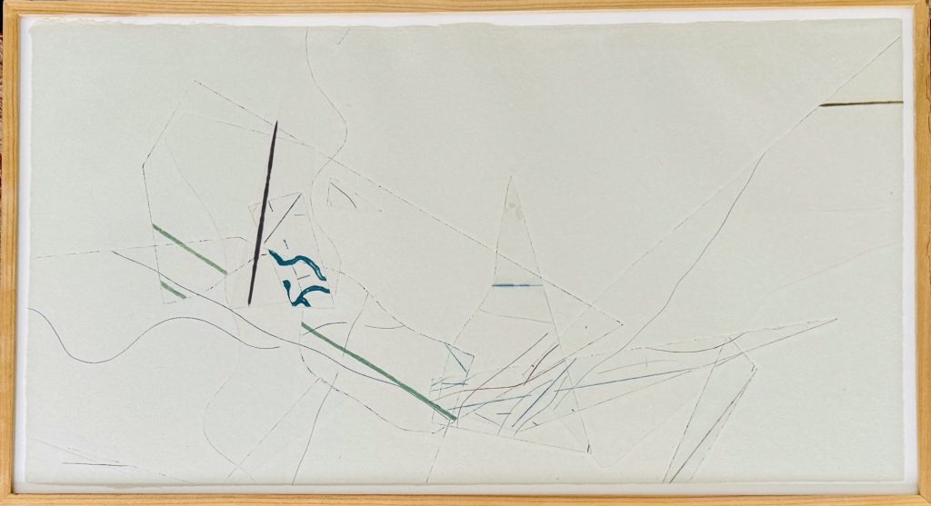
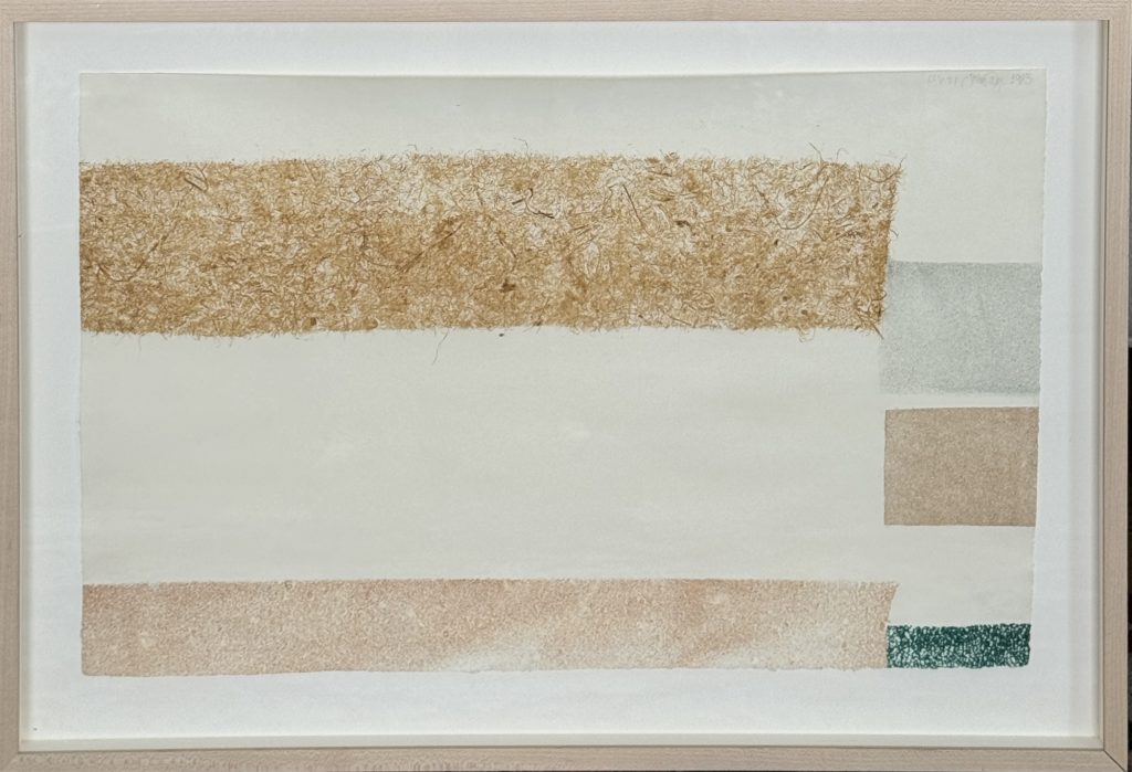
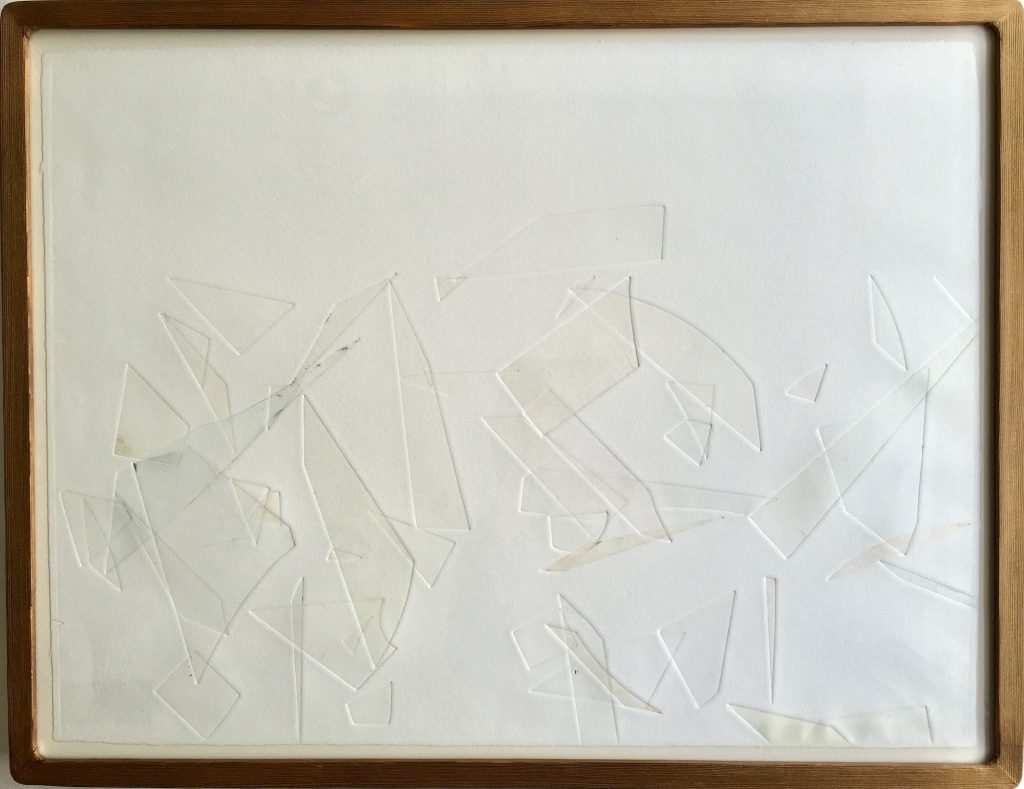
JENNIFER BAAHNG is pleased to present INDETERMINACY, an exhibition featuring a carefully curated selection of John Cage’s most influential works on paper. The exhibition examines Cage’s deliberate, neutral approach to removing personal bias from the creative process. The concept of silence, embodied in INDETERMINACY, is conveyed through visual representations that reflect Cage’s broad philosophical views.

John Cage’s engagement with Gertrude Stein’s work spanned his entire career, beginning with his early musical settings of her poems in the 1930s and evolving into a philosophical connection to her ‘landscape’ approach to language. He believed that meaning was flexible, often using words beyond their usual senses. This perspective created a surface of sound and text characterized by a non-hierarchical structure. Immediate perception, similar to Stein’s ‘continuous present,’ aimed to immerse the audience in the world as it is, removing symbolic baggage from art.

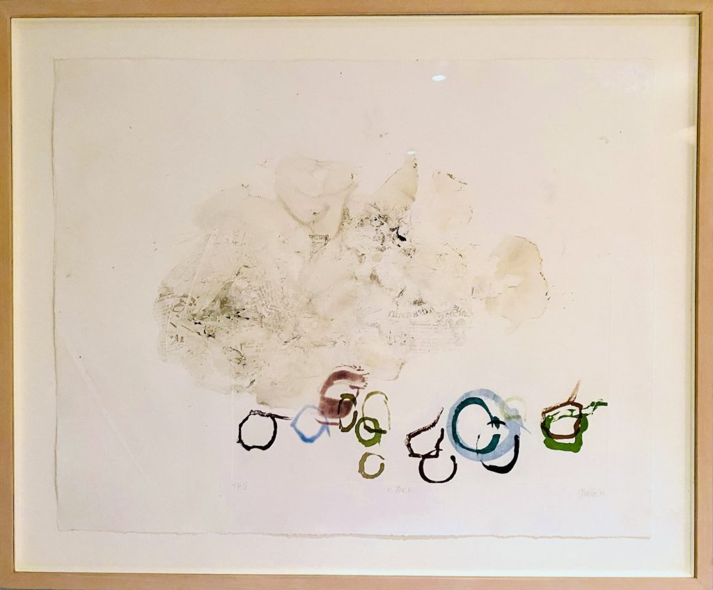
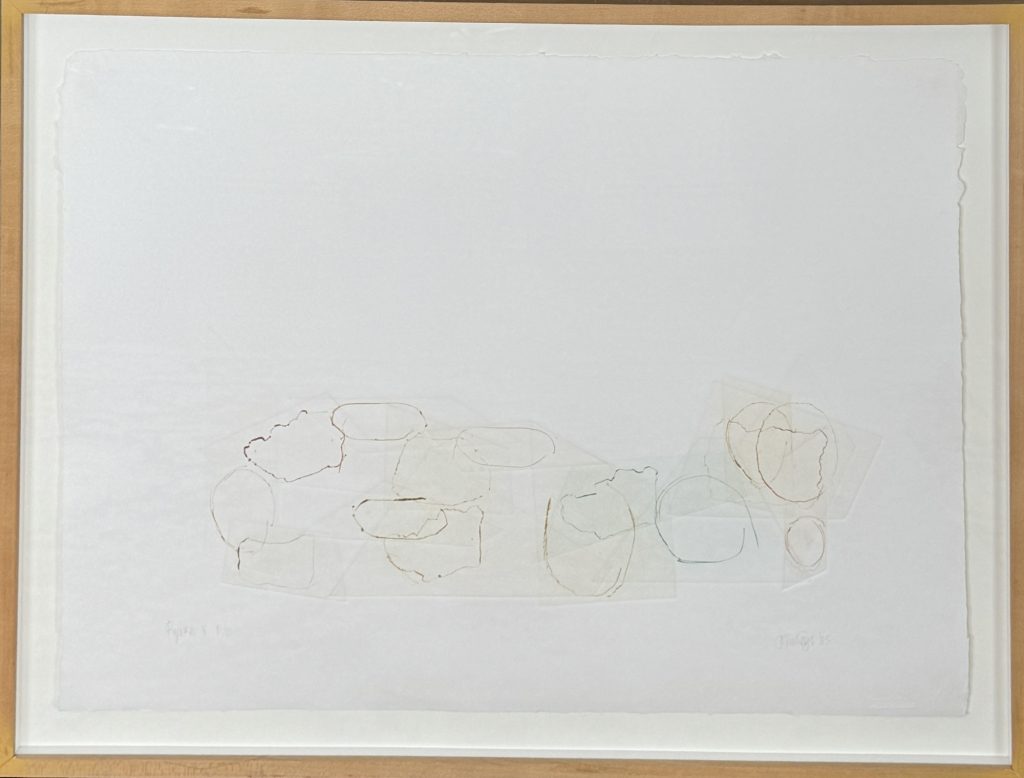
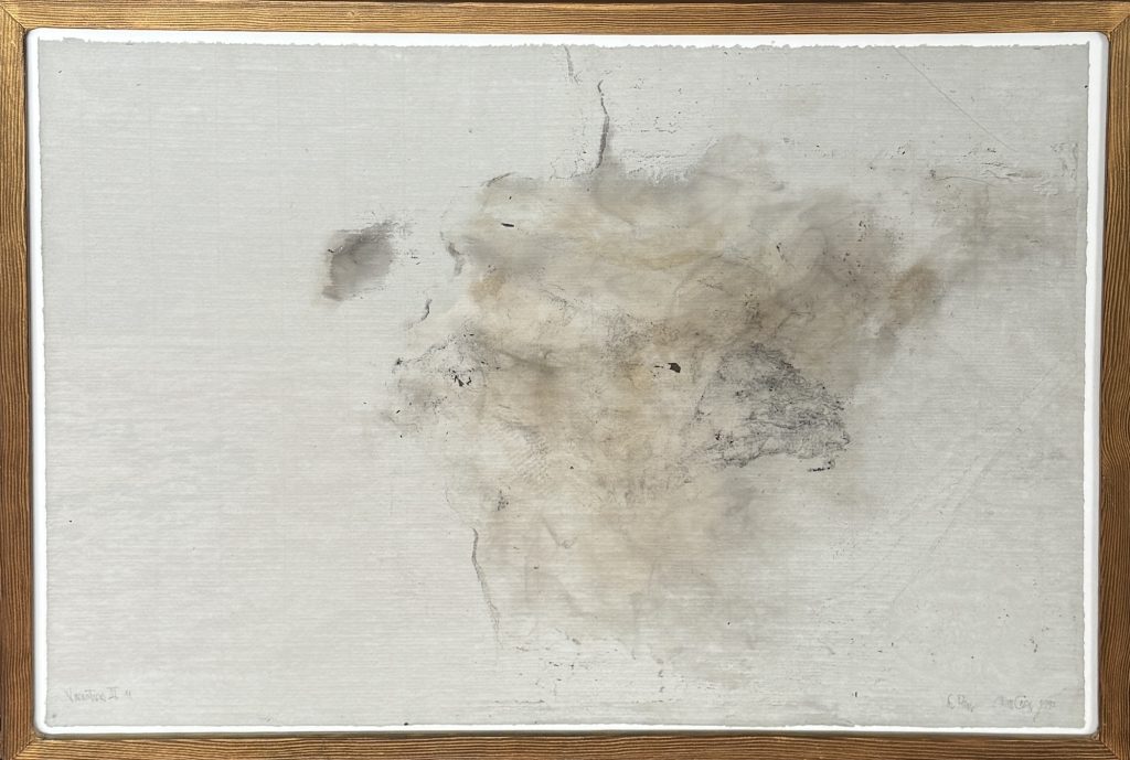
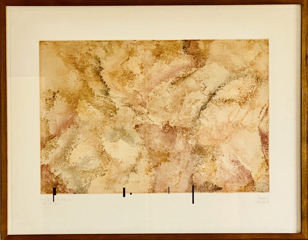
John Cage used the I Ching to determine the sequence of plates, ink colors, and placement, freeing the artist’s imagination. The tension between effort and randomness remains evident throughout his work. “Changes and Disappearances No. 21” (1980), which required hundreds of iterations, and “Where There Is Where There Is – Urban Landscape No. 31” (1987, 1989), establish a visual language reflecting Cage’s interest in Stein’s writings, creating a surface with fluid and undecided meaning. “11 Stones 2” (1989) and “On the Surface” (1980-1982) highlight Cage’s collaboration with natural elements. “HV #21” (1983) explores a landscape of chance, delving into the horizon of indeterminacy. Using smoke and fire during the paper preparation in “Variations III No. 11” (1992), Cage allows the environment to influence the printmaking process. The resulting images serve as atmospheric echoes of the I Ching process, not depicting stones but traces of a performance involving a stone, a flame, and a piece of paper.

The entire series of the thirteen “Ryoku” suite (1985) illustrates Cage’s shift from traditional composition to a method centered on disciplined randomness. These works highlight a unique variation in the process, focusing on the detailed complexity of drypoint marks and showcasing a precise, systematic approach. Using the I Ching, Cage created a visual environment where marks do not simply express emotion; instead, they occupy space in a neutral, objective way.

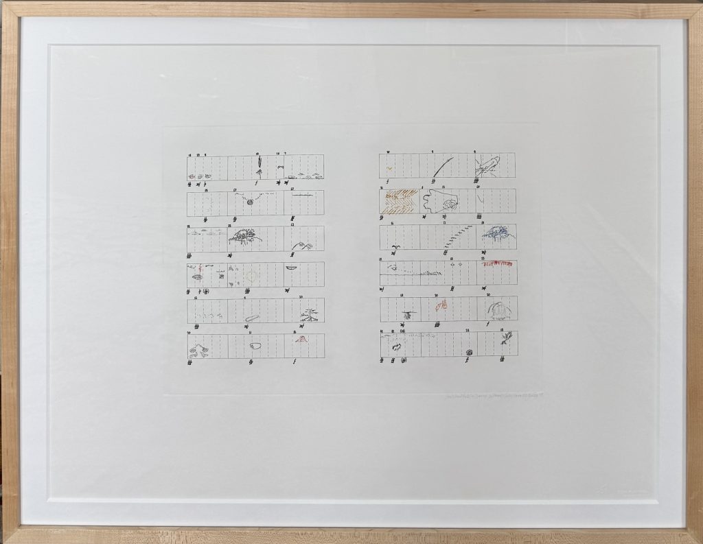
While John Cage used the term to describe his 1959 collection of 90 stories,  Indeterminacy is a fundamental element of his visual art practice. Cage’s works on paper serve as musical scores with graphic notation. These scores are indeterminate in performance and open to multiple interpretations. In this exhibition, chance refers to the random methods used in composition, while indeterminacy signifies the open-ended nature of the final work. By removing the self from the center of the artwork, John Cage invites us to see the paper as a window into a constantly changing yet still present world. INDETERMINACY aligns closely with his intention, as the works rely on chance to shape their unconstrained final form.

ARTIST

John Cage

Categories: exhibitions

Tags:

R. C. Baker

R. C. Baker TRACED AND PLATED

WE ARE THE LAND

R. C. Baker

Traced and Plated

November 10 – December 30, 2025

WATCH THE VIDEOS

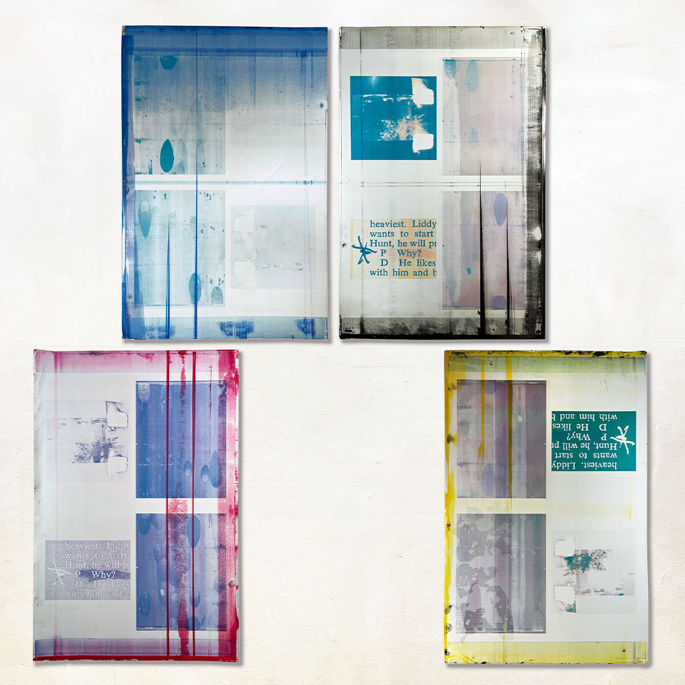
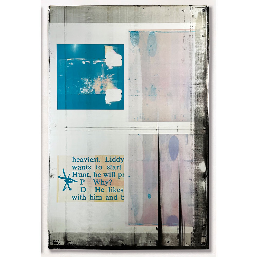
“Traced and Plated,” part of a curatorial initiative by JENNIFER BAAHNG titled “WE ARE THE LAND,” showcases the repurposing and transformation of discarded remnants of mass media, providing a compelling reflection on how human actions leave imprints and scars on the land we occupy. R.C. Baker’s newspaper monoprints and printing plate works affirm the enduring vitality of painting by integrating new materials, repurposing physical printing media, and challenging the landscape genre within contemporary art.

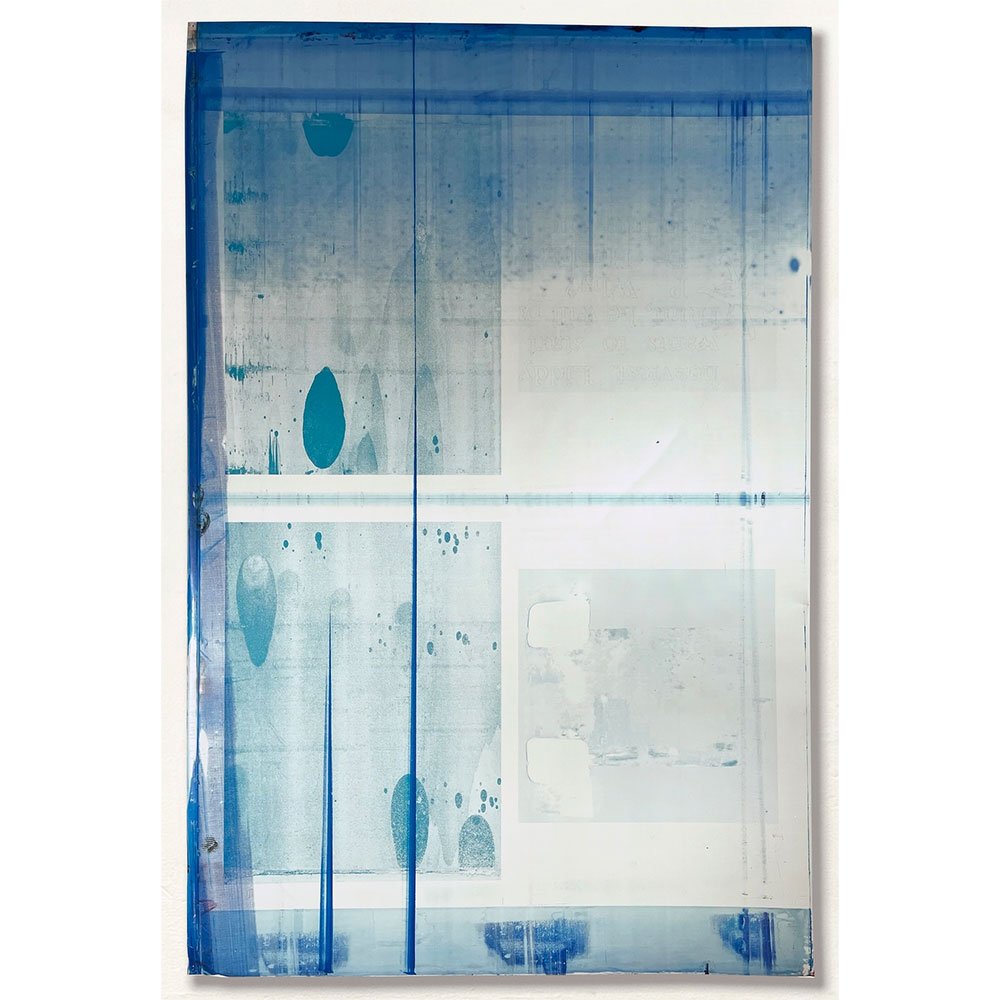
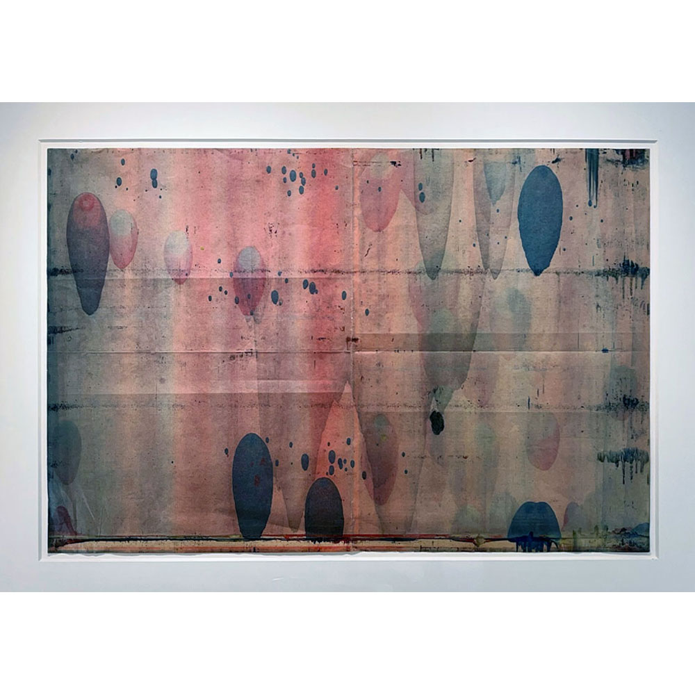
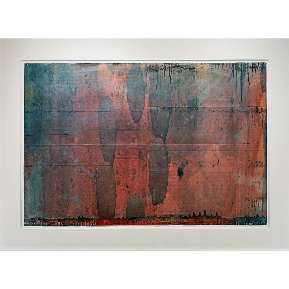
Baker’s “Jornada Del Muerto” monoprints were begun in the early 2000s, when high-speed newspaper presses were being cleaned with solvent sprays by pressmen anxious to start a new press run. As the press cylinders slowed, the solvents spread. When they mixed with the remaining inks, the articles, graphics, and halftone photos that were originally being printed for the Village Voice Literary Supplement were transformed into bulbous blurs of irradiated color, creating serendipitous abstractions on the last few pages as the huge presses ground to a halt.

Baker transferred these sheets to his studio, and in 2008 completed them by adding titles — Jornada del Muerto +250,000 Years and Jornada del Muerto +400,000 Years — that arose from his research into atomic bomb tests and nuclear waste repositories in the deserts of the American Southwest. These titles (English translation, “Journey of the Dead Man”) refer to a desolate yet majestically bleak desert landscape in New Mexico.

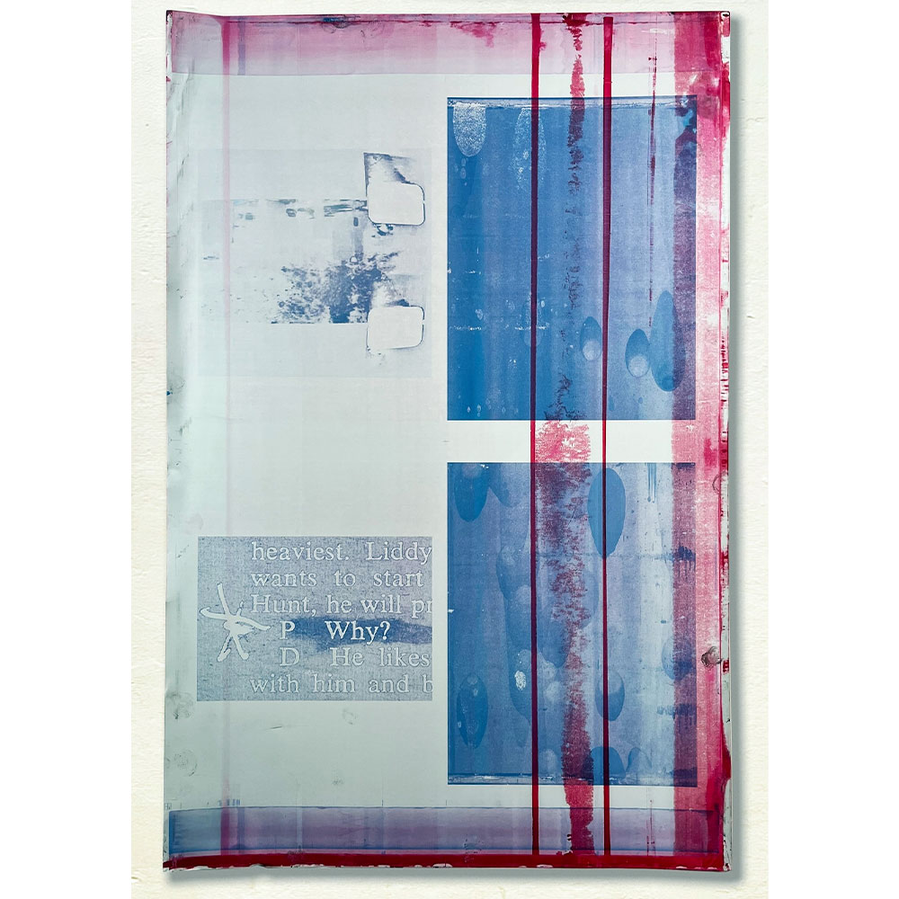
A decade later, Baker printed a tabloid newspaper, “President: ‘Why?’”, which served as a catalog for a 2018 exhibition, and realized he could create a conceptual loop by reproducing in it one of the “Jornada” abstractions. For those two pages in the tabloid he added magenta to emphasize the long-term irradiation of the desert, caused by the half-lives of nuclear elements in fallout from weapons testing and in the radioactive waste being stored in vast subterranean chambers in the Southwest. The four printing plates that had been utilized to print the tabloid’s “Jornada del Muerto +250,000 Years” spread — covered with inks and solvents in uncontrolled and unpredictable manners — became ready-made artworks, despite the pressmen viewing them as suitable only for recycling the aluminum substrates. These two pages were complemented by another set featuring images such as an existential quote from President Nixon—“Why?”—and a frame from Abraham Zapruder’s 8mm film of the JFK assassination. The vibrant, lava-lamp-like blobs of color evoked a title combining tragedy and elegance: “Zapruder Rising,” a collection of four plate paintings.

“Traced and Plated” affirms that the material history of our media is deeply connected with the ecological future of the earth. Our industrial endeavors have left enduring marks of control, extraction, and waste on the land. By presenting a novel and compelling visual framework in contemporary art, where material and aesthetic intent converge into a unified art form, the exhibition extends beyond a historical perspective. It contextualizes present ecological challenges, including severe land and water contamination and the significant impacts of climate change, and elucidates the intrinsic link between media cycles, materials, and ecological realities in a new genre of landscape paintings. “WE ARE THE LAND: Traced and Plated” emphasizes the abstract beauty and residual history embedded within the artwork, encouraging reflection on the land we inhabit, as both chroniclers and bearers of scars.

ARTIST

R. C. Baker

Categories: exhibitions

Tags:

Janet Taylor Pickett

Janet Taylor Pickett

Janet Taylor Pickett

CONJURE

October 13 – November 30, 2025

WATCH THE VIDEOS

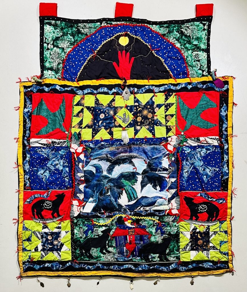
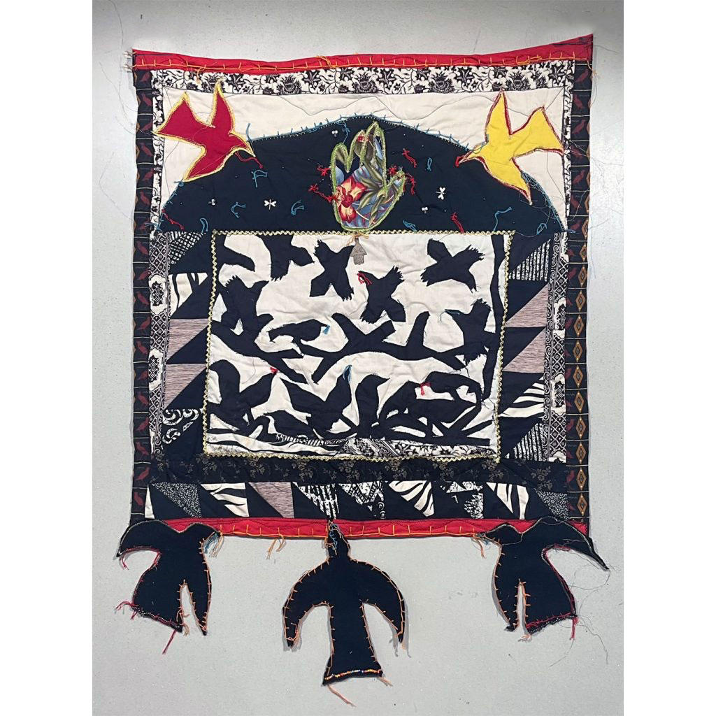
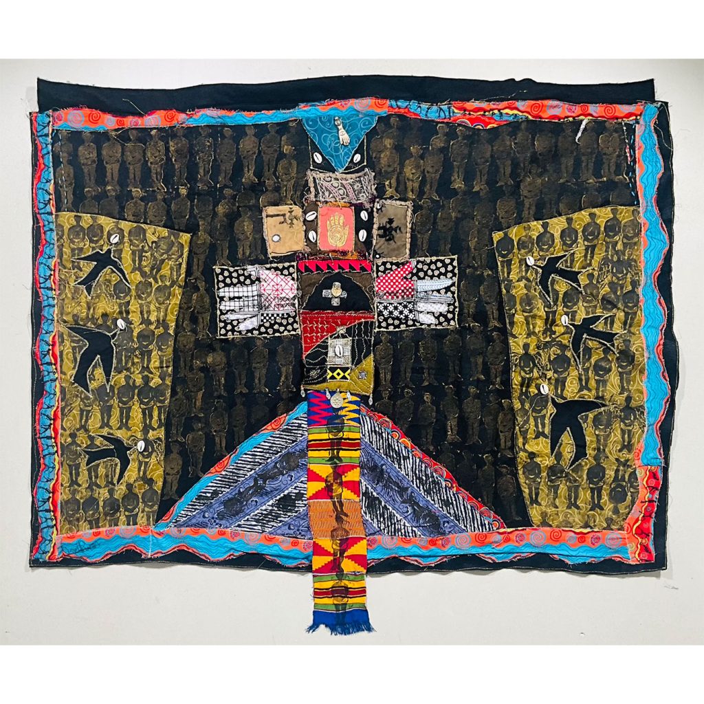
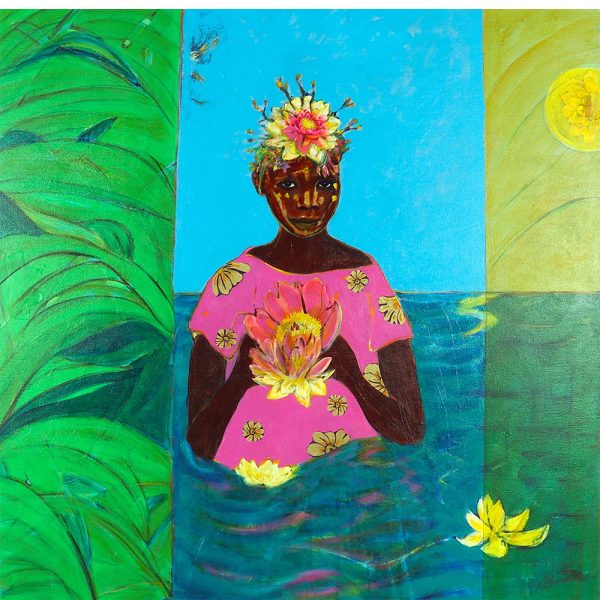
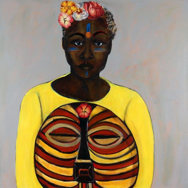
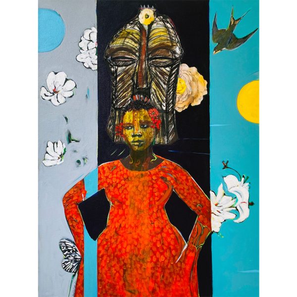
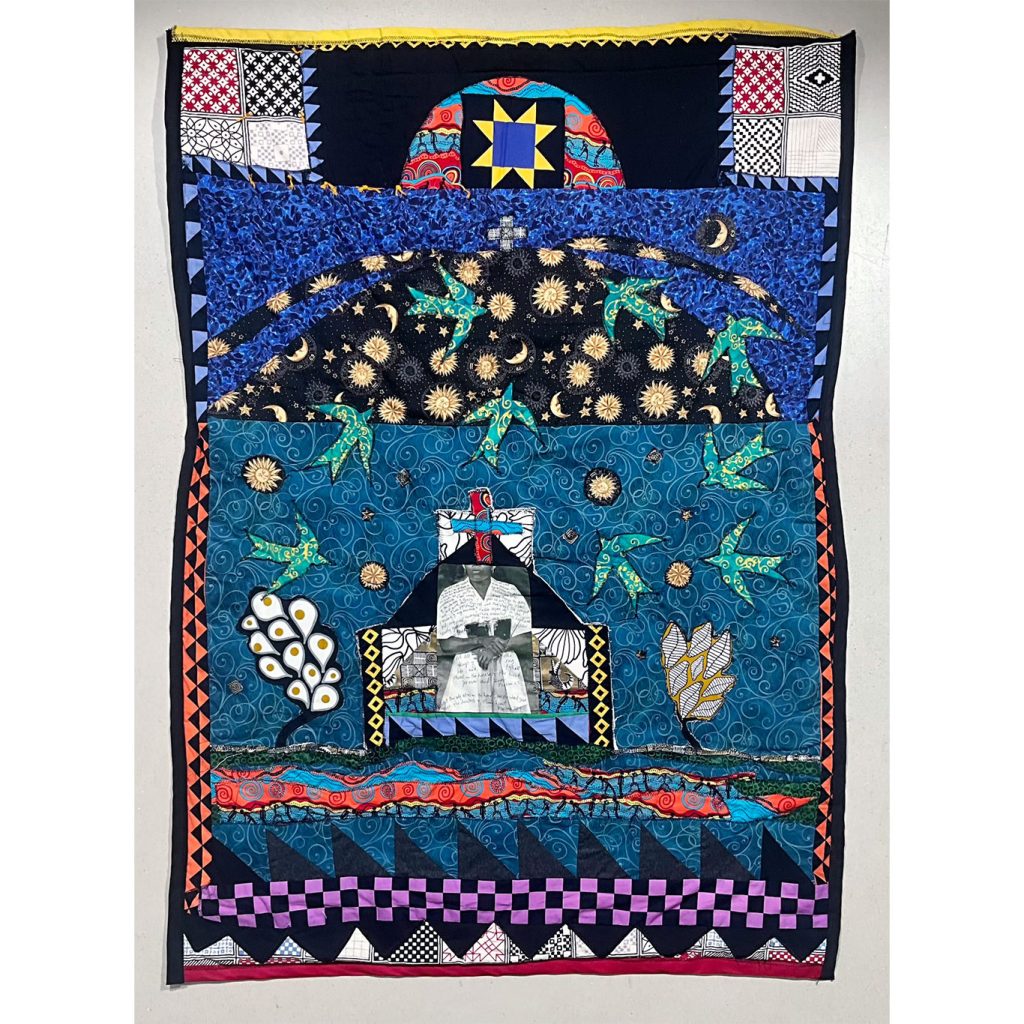
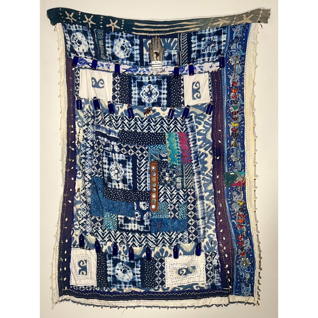
Janet Taylor Pickett’s fabric constructions commenced in the early 1990s, featuring imagery that was deeply personal yet accessible. Her work investigated themes related to ecology, motherhood, and transcendence. A profound sense of loss prompted her to reconsider what truly matters in a well-lived life. An aphorism reinforced her conviction in navigating adversity to discover what is life-affirming. These works resonate as familiar and inviting, illustrating connections that evoke the past and paving the way with new materials and directions. CONJURE provides a succinct overview of Taylor Pickett’s fabric constructions from 1993 to 2022.

Memory serves as a living metaphor in Taylor Pickett’s art. In 1991, she took part in a workshop at the Vermont Studio Center with the renowned Color Field and abstractionist painter Sam Gilliam. Inspired by his innovative use of beveled edges and drapes over paintings, Taylor Pickett was encouraged to go beyond flat surfaces and include sculptural elements in her work. As a result, she created compelling, grommet-mural pieces. In January 1993, her father passed away; he was like a tall oak tree whom she admired and loved. On a clear autumn morning in November 1996, her mother also passed away; she was a guiding presence in Taylor Pickett’s signature visual motifs: fabrics, botanicals, birds, and flowers. As an only child, the loss of her parents marked a major turning point in her life and lowered her vitality, leading to a creative block.

The 1990s brought significant changes to Taylor Pickett’s life and her artistic journey; the concept of memory became central to her creative work. When she experienced painter’s block, she turned to fabric as a form of expression. Influences from Romare Bearden, Henri Matisse—her artistic predecessors—and her paternal grandmother, a quilter, inspired her fabric art. Quilting, a calming and comforting craft, helped Taylor Pickett transform her grief into a healing experience. Through sewing and stitching, her grief becomes a nourishing and joyful legacy that guides her forward.

CONJURE, a collection of fabric constructions, aims to document the artist’s ongoing journey of self-actualization—“homing.” Surrounded by vibrant colors, tendrils of flora, and intricate textiles, the subjects in Janet Taylor Pickett’s work dominate their lively environment, commanding the frame as the essential element in each fabric piece. It draws inspiration from actively shaping and refining memories into a comforting space for the mind, which the artist’s personal geography—the self-landscape of memory—reveals.

Categories: exhibitions

Tags:

NOBUO SEKINE

WE ARE THE LAND

WE ARE THE LAND

Nobuo Sekine

Phase Conception: Spring Sea

September 9 – October 31, 2025

WATCH THE VIDEOS

A JENNIFER BAAHNG curatorial series, WE ARE THE LAND, begins with Nobuo Sekine’s monumental piece, “Phase Conception: Spring Sea” (1988). This artwork provides a compelling and relevant reflection on human interaction with the physical world. Sekine’s body of work—marked by precise formal craftsmanship, material resonance, and philosophical insight—explores the boundary between humanity and nature. His work is neither intrusive nor didactic; it remains calm, contemplative, and deeply connected, like the land itself. As contemporary artists seek to interpret and respond to ecological changes, WE ARE THE LAND features artworks that portray land as a symbol of identity, process, and interconnectedness.

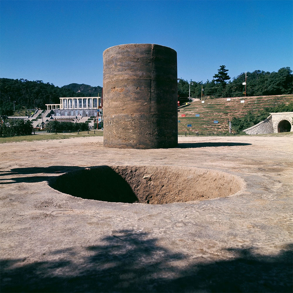
Nobuo Sekine, a pioneering figure in postwar Japanese art, gained notable recognition in the mid-1960s as a co-founder of Mono-ha, also known as the “School of Things.” His exploration of natural and industrial materials demonstrated how these materials exist within the context of space and time. In Sekine’s early masterpiece, “Phase-Mother Earth” (1968), a cylindrical hole was excavated into the ground, and the displaced earth was shaped into a nearby column. This simple yet profound act highlighted Sekine’s long-standing focus on dualities—absence and presence, form and formlessness, earth and void; land itself serving as both the medium and subject.

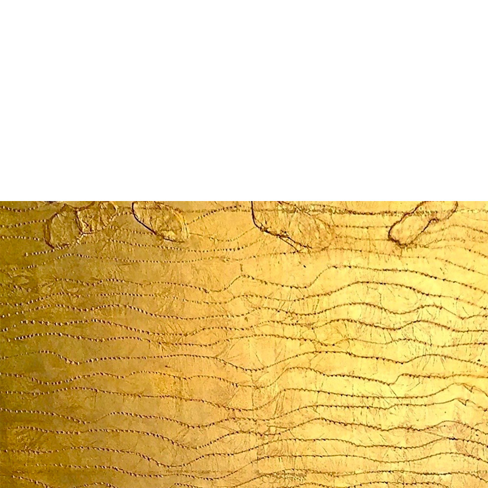
In the 1980s, Nobuo Sekine launched the Phase Conception painting series, which captured the essence of Mono-ha. These later works, created with handmade paper, gold leaf, and industrial materials, emphasize his enduring interest in temporality, spatiality, and materiality. “Phase Conception: Spring Sea” exemplifies this concept through a wall installation while preserving the conceptual depth of his earthworks. It ranks among the largest pieces in his Phase Conception series. The title signifies a transitional season marked by awakening, fluidity, and atmospheric change. The surface appears shimmering, absorbing, and emitting—evoking a sense of vitality, responsiveness, and instability.

The visual intricacies in “Phase Conception: Spring Sea” are characterized by dense, earthy textures and cavities produced through gouged-out sections of the painting and their subsequent reapplication to the surface, echoing the theme of “Phase-Mother Earth.” Fluid, gestural brushstrokes suggest water flowing across the terrain. The artwork does not narrate a story; rather, it reflects interactions among various elements, establishing a complex relationship between materials. As Sekine posits, land is not a passive entity but an active realm; the painting is a site.

In an era marked by environmental crises, climate instability, and global displacement, WE ARE THE LAND explores a core truth. It questions the modern urge to dominate, control, or aestheticize nature. It invites us to be present, to feel, to perceive, and to see ourselves as connected to the physical world. Nobuo Sekine’s “Phase Conception: Spring Sea” offers a perspective on the world that is not centered on humans. It encourages us to understand what it means to be land — to shimmer, to shift, to erode, and to endure. WE ARE THE LAND reminds us that sometimes the most daring act is to do less, to observe more, and to coexist with what already exists.

BIO

Nobuo Sekine was a significant figure in postwar Japanese art and a prominent member of the Mono-ha movement. Born in Saitama, Japan, in 1942, he studied at Tama Art University in Tokyo, where he first developed an interest in sculpture and site-specific art. His 1968 earthwork “Phase-Mother Earth” is widely recognized as the catalyst for Mono-ha, a movement that redefined the artist’s relationship with materials, space, and perception. Sekine showcased his work internationally throughout his career, including at the Venice Biennale (1970). His pieces are part of the permanent collections of museums worldwide, such as the Guggenheim Museum, the National Museum of Modern Art in Tokyo, and the Leeum Museum of Art in Seoul. Until he died in 2019, Sekine continued to be influential in reshaping the boundaries between object, environment, and perception.

ARTIST

Nobuo Sekine

Categories: exhibitions

Tags:

SUE MCNALLY

Sue McNally THIS IS MY TUNE

Sue McNally

THIS IS MY TUNE

August 16 – October 27, 2025

WATCH THE VIDEOS

Opening Reception:

Saturday, August 16, 4 – 6 PM

Artist’s Talk: 

Saturday, August 16, 4:30 PM

Location:

Saint-Gaudens National Historical Park

139 Saint-Gaudens Road, NH 03745

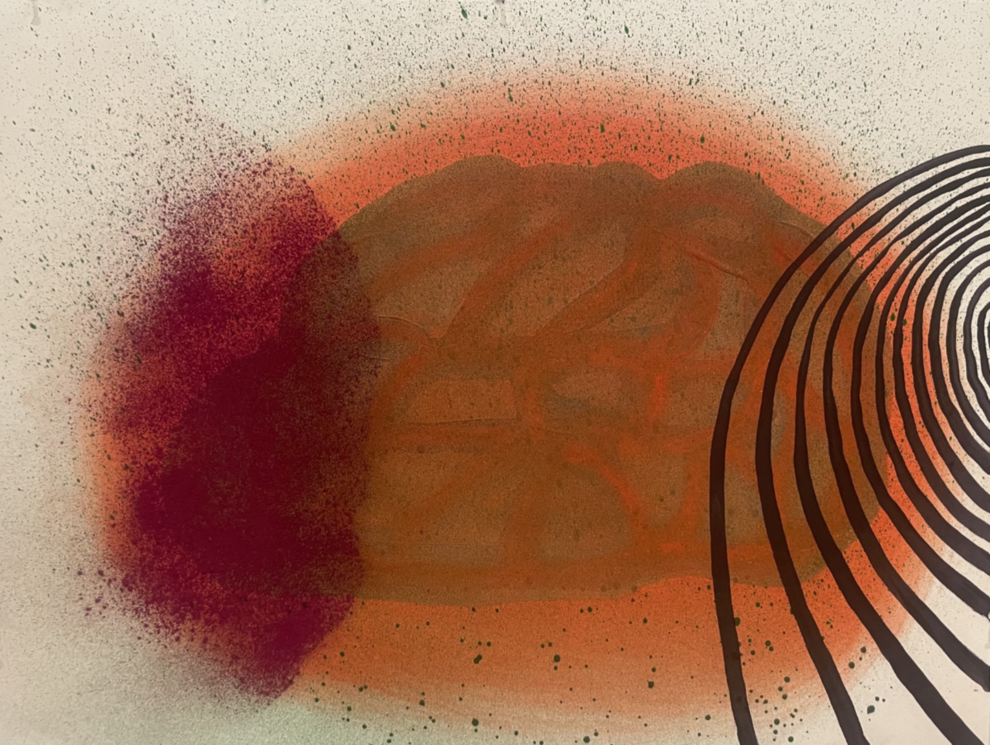
As the series evolved, so did my process. Over time, expressive interpretation replaced literal depiction. My focus shifted from geographic accuracy to memory, identity, and experience. The landscape remained the structure, but the act of painting itself began to lead . . . Each piece marks a moment in my practice that signifies a shift in how I approach making.

For more than thirty years, Sue McNally has been painting landscapes, usually multiple landscapes at a time, in an undertaking of discovery through an exploration of surface, tools, mark-making, and color. This Is My Tune features paintings created in the last decade that present an evolution in the artist’s focus and process. While the landscape of the United States is the dominant subject, these vibrant, large canvases reveal a shift from an emphasis on the specificity of location and a reliance on photographic reference material to the intuitive process of painting and exploration of materials.

Sue McNally is based in Newport, Rhode Island, with a creative practice spanning locations in Rhode Island and southeastern Utah. Raised in New England, she earned a BFA from the University of Rhode Island and an MFA from the Savannah College of Art and Design. McNally has held numerous artist residencies, including the Edward E. Elson Artist-in-Residence at the Addison Gallery of American Art, as well as residencies at Carrizozo AIR, Crater Lake National Park, Vermont Studio Center, and Yaddo. Her artwork is included in the permanent collections of several museums, including the Addison Gallery of American Art, the Newport Art Museum, the North Dakota Museum of Art, the RISD Museum, the Tamarind Institute Archive, and the Worcester Art Museum. McNally is represented by Jennifer Baahng Gallery in New York.

ARTIST

Sue McNally

Categories: exhibitions

Tags:

JAYE MOON

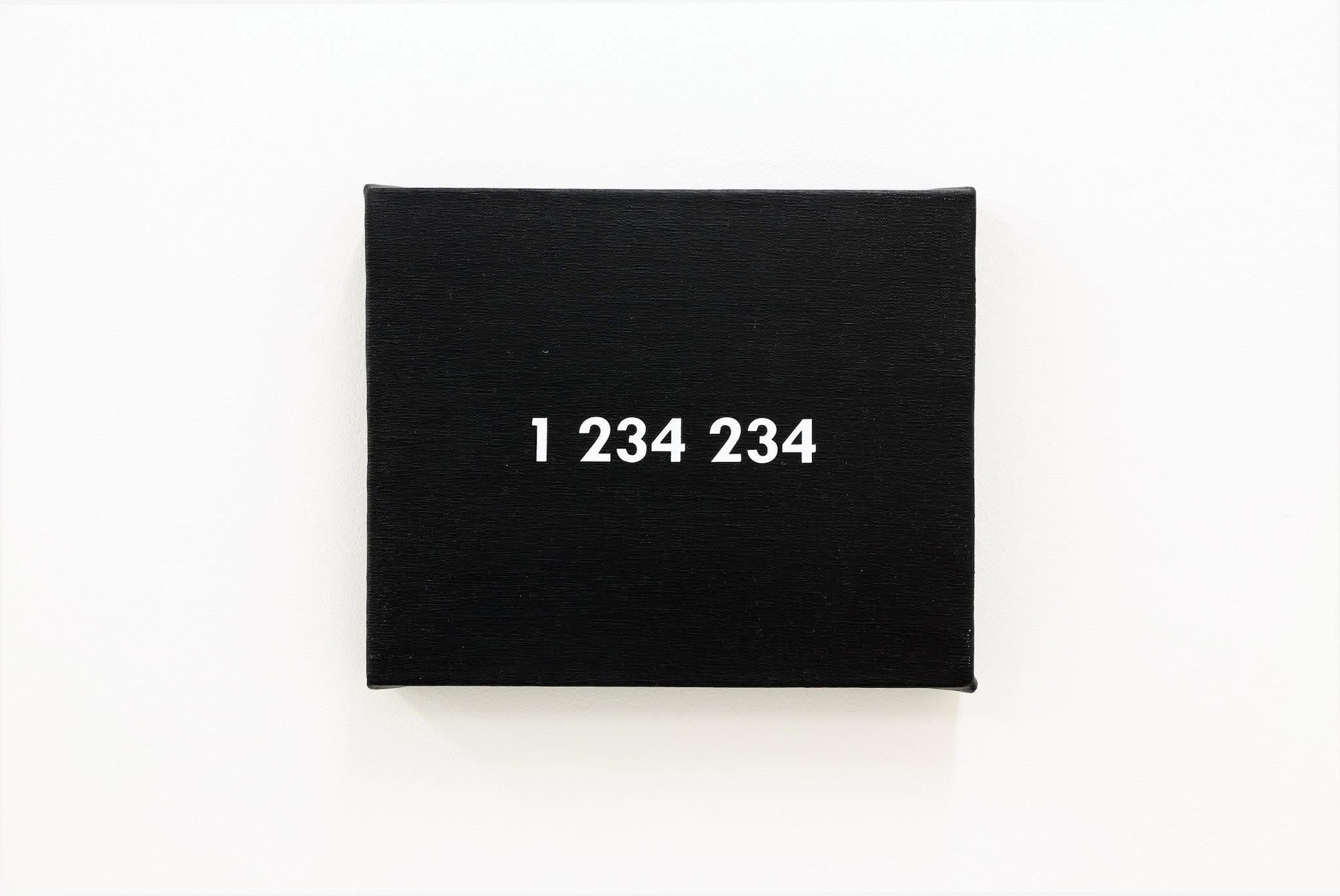
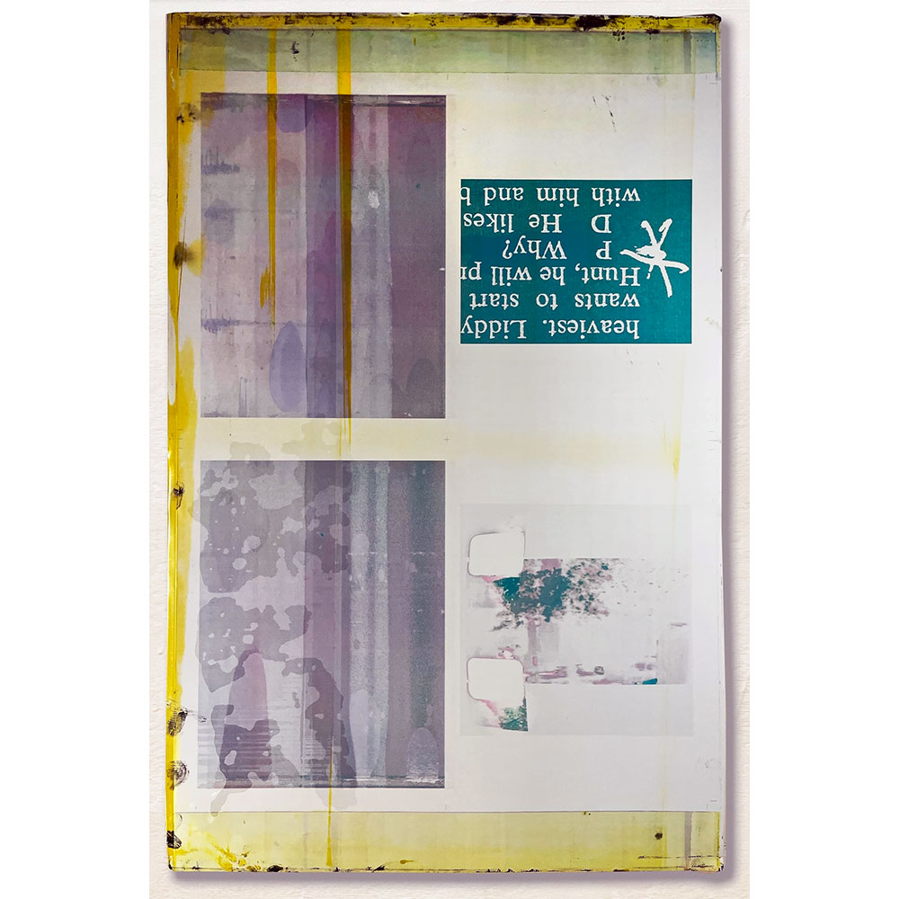
Jaye Moon F.U.C.k, 2012 Acrylic on canvas 8 x 10 inches
Jaye Moon
PRIVATE

June 1 – 30, 2025

WATCH THE VIDEOS

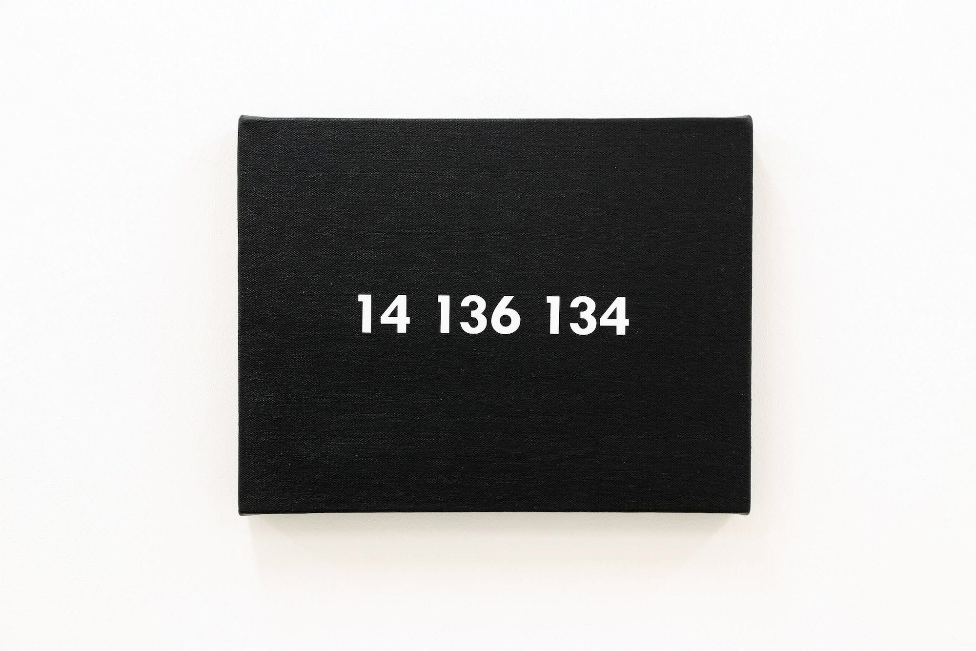
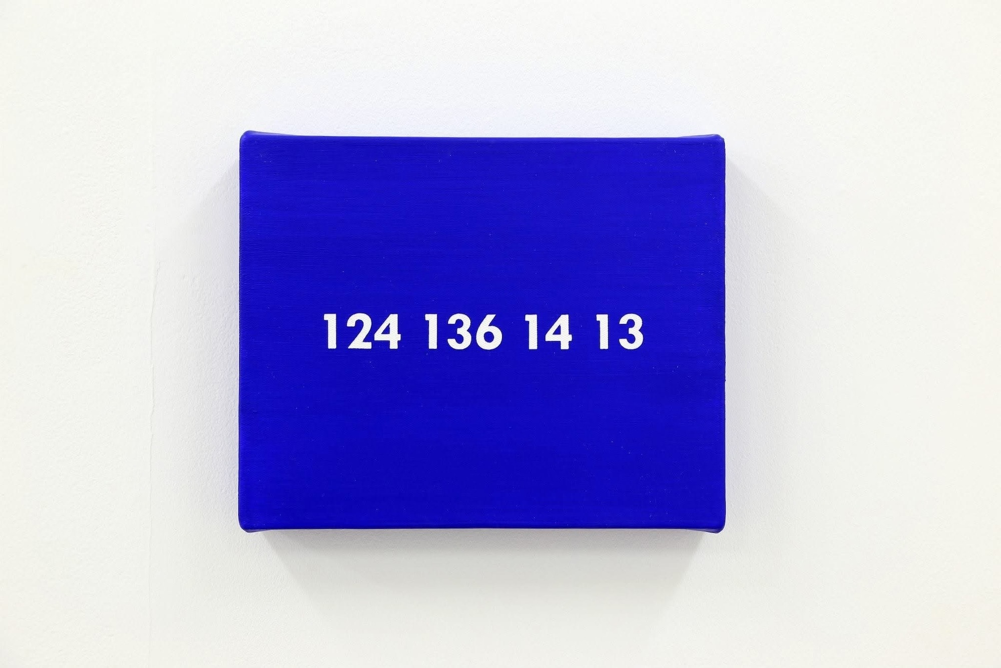
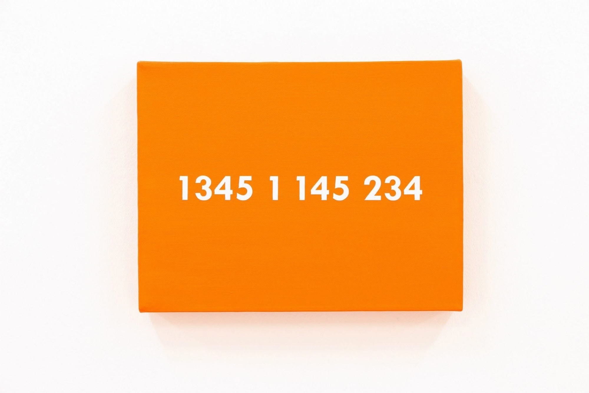
PRIVATE presents Jaye Moon’s 2012 Number Paintings, mobilizing systems of communication not to disclose, but to conceal.  Within a lineage of conceptual art that privileges structure over narrative, the exhibition reveals strategies of communication that are measured, coded, and aesthetically controlled.

Number Paintings reference On Kawara’s canonical Date Paintings, which adheres to a strict formal program, canvas sizes, restrained grounds, and uniformly rendered dates in the language and gesture.  Each date marks a day lived without narrativizing the content of that day.  The absence becomes the message, suggesting presence and contemporaneity but withholding any subjective anchoring.

Jaye Moon mirrors this formal apparatus and repurposes it through the lens of linguistic encryption.  Her Number Paintings maintain the aesthetic and procedural fidelity of Kawara’s format. Instead of universalized dates, Moon features encoded Braille messages—transposed into numerical form through a system derived from the Braille alphabet’s dot configurations.  This use of Braille, a tactile writing system used by people who are visually impaired, further complicates the relationship between legibility, visibility, and access.  It serves as a metaphor for the complex nature of communication in subversion, as well as the use of tabooed words.  Her language is not absent, but rather present in another register that requires translation.
Where On Kawara constructs privacy through erasure and minimalism, Jaye Moon constructs it through obfuscation and code.  Both artists instrumentalize the mode of refusal, turning systems of language into architectures of protection.  Their works challenge the concept of communication, particularly in terms of personal or emotional meaning, which must be shielded, deferred, or encrypted.  In this sense, communication is not a conduit but a boundary.
PRIVATE frames privacy as an active aesthetic condition. Sustained through visual and linguistic constraints, Jaye Moon’s critical practice offers a poetics of discretion. PRIVATE values the careful and deliberate control of information, as well as resistance and the right to remain unread.

ARTIST

Jaye Moon
Categories: exhibitions

Tags:

JANET TAYLOR PICKETT

Janet Taylor Pickett Memory of Water II, 2021 Acrylic and collage on canvas 40 x 40 inches
Janet Taylor Pickett

The Selma Burke Invitational African American Art Show
May 30 – June 29, 2025

Phillips’ Mill, New Hope, PA

WATCH THE VIDEOS

The gallery artist Janet Taylor Pickett is participating in the Selma Burke Invitational African American Art Show, on view from May 30 through June 29, 2025, at Phillips’ Mill.  Curated to expand the presentation of African American art and culture beyond the major cities of Philadelphia and New York and invigorate the historical context of Phillips Mill, the focal point of Impressionist art in America. During her 45 years in New Hope, Selma Burke taught youth and adults and contributed to depicting Franklin D. Roosevelt on the dime. The exhibition celebrates the legacy of Selma Burke and the works of all Black artists, challenging stereotypes and honoring Black art, history, and culture. Presented artists include Edward Bannister, Romare Bearden, Chakaia Booker, Kimberly Camp, Willie Cole, Thornton Dial, Wilfredo Lam, Norman Lewis, Faith Ringgold, Mickalene Thomas, and Hale Woodruff.

Categories: exhibitions

Tags: